The grid-gap property is used to specify the size of the gap between the rows, and between the columns. This property is a shorthand for the following properties:
- grid-row-gap, specifying the gap size between rows.
- grid-column-gap, specifying the gap size between columns.
Gap replaces the grid-gap prefixed property. But this prefixed property will be needed for browsers that implemented grid-gap instead of the gap.
| Initial Value | normal normal |
| Applies to | Grid containers. |
| Inherited | No. |
| Animatable | Yes. Gap is animatable. |
| Version | CSS Grid Layout Module Level 1 |
| DOM Syntax | object.style.gridGap = "30px 70px"; |
Syntax
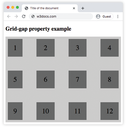
grid-gap: grid-row-gap | grid-column-gap | initial | inherit;Example of the grid-gap property:
<!DOCTYPE html>
<html>
  <head>
    <title>Title of the document</title>
    <style>
      .grid-container {
        display: grid;
        grid-template-columns: auto auto auto auto;
        grid-gap: 60px;
        background-color: #ccc;
        padding: 10px;
      }
      .grid-container > div {
        background-color: #666;
        text-align: center;
        padding: 20px 0;
        font-size: 30px;
      }
    </style>
  </head>
  <body>
    <h2>Grid-gap property example</h2>
    <div class="grid-container">
      <div>1</div>
      <div>2</div>
      <div>3</div>
      <div>4</div>
      <div>5</div>
      <div>6</div>
      <div>7</div>
      <div>8</div>
      <div>9</div>
      <div>10</div>
      <div>11</div>
      <div>12</div>
    </div>
  </body>
</html>Result
Example of the grid-gap property specified in percentages:
<!DOCTYPE html>
<html>
  <head>
    <title>Title of the document</title>
    <style>
      .grid-container {
        display: grid;
        grid-template-columns: auto auto auto auto;
        grid-gap: 20%;
        background-color: #ccc;
        padding: 10px;
      }
      .grid-container > div {
        background-color: #666;
        text-align: center;
        padding: 20px 0;
        font-size: 30px;
      }
    </style>
  </head>
  <body>
    <h2>Grid-gap property example</h2>
    <div class="grid-container">
      <div>1</div>
      <div>2</div>
      <div>3</div>
      <div>4</div>
      <div>5</div>
      <div>6</div>
      <div>7</div>
      <div>8</div>
    </div>
  </body>
</html>Example of the grid-gap property with two values:
<!DOCTYPE html>
<html>
  <head>
    <title>Title of the document</title>
    <style>
      .grid-container {
        display: grid;
        grid-template-columns: auto auto auto auto;
        grid-gap: 20px 80px;
        background-color: #ccc;
        padding: 10px;
      }
      .grid-container > div {
        background-color: #666;
        text-align: center;
        padding: 20px 0;
        font-size: 30px;
      }
    </style>
  </head>
  <body>
    <h2>Grid-gap property example</h2>
    <div class="grid-container">
      <div>1</div>
      <div>2</div>
      <div>3</div>
      <div>4</div>
      <div>5</div>
      <div>6</div>
      <div>7</div>
      <div>8</div>
      <div>9</div>
      <div>10</div>
      <div>11</div>
      <div>12</div>
    </div>
  </body>
</html>Values
| Value | Description | Play it |
|---|---|---|
| grid-row-gap | Specifies the size of the gap between the rows in a grid layout. The default value is 0. | |
| grid-column-gap | Specifies the size of the gap between the columns in a grid layout. The default value is 0. | Play it » |
| initial | Makes the property use its default value. | |
| inherit | Inherits the property from its parents element. |
Browser support
|
|
|
|
|
|---|---|---|---|---|
| 57+ | 16+ | 52+ | 10.1+ | 44+ |
Practice Your Knowledge
What is the use of the 'grid-gap' property in CSS?
Correct!
Incorrect!
Quiz Time: Test Your Skills!
Ready to challenge what you've learned? Dive into our interactive quizzes for a deeper understanding and a fun way to reinforce your knowledge.