How to Add Border to Image in CSS
Images with borders or frames make the image look more influential and differ from the other content on the page. In this snippet, we will show how to add a border to the image.
The <img> element has a border attribute that is not in use in HTML5. So, we recommend using the CSS border property instead.
Create HTML
- In the <body> section, create an <img> element and put the link of the image that should be used.
- Set the name for the image with the alt attribute which gives information about the image if a user cannot view it, for some reason.
<img src="/uploads/media/default/0001/01/b408569013c0bb32b2afb0f0d45e93e982347951.jpeg" alt="Nature">Add CSS
- Add style to your <img> element.
- Define the width of the image.
- Define the width, style, and color of the border with the help of the border property.
img {
  width: 270px;
  border: 1px solid black;
}
Example of adding a border to the image:
<!DOCTYPE html>
<html>
  <head>
    <title>Title of the document</title>
    <style>
      img {
        width: 270px;
        border: 1px solid black;
      }
    </style>
  </head>
  <body>
    <img src="/uploads/media/default/0001/01/b408569013c0bb32b2afb0f0d45e93e982347951.jpeg" alt="Nature">
  </body>
</html>Result

How to Add Styling to the Border Image
To change the border color, you can add the CSS color property. If you want to create a double border, you need to add the padding property to the style of your image.
Example of adding a double border to the image:
<!DOCTYPE html>
<html>
  <head>
    <title>Title of the document</title>
    <style>
      img {
        width: 650px;
        padding: 1px;
        border: 1px solid #021a40;
      }
    </style>
  </head>
  <body>
    <h2>Double Border Example</h2>
    <img src="/uploads/media/default/0001/01/b408569013c0bb32b2afb0f0d45e93e982347951.jpeg" alt="Nature">
  </body>
</html>It is also possible to have a double border with different inside border color. For that purpose, add the background-color property.
Example of styling the double border of the image:
<!DOCTYPE html>
<html>
  <head>
    <title>Title of the document</title>
    <style>
      img {
        width: 650px;
        padding: 5px;
        border: 8px solid #999999;
        background-color: #e6e6e6;
      }
    </style>
  </head>
  <body>
    <img src="/uploads/media/default/0001/01/b408569013c0bb32b2afb0f0d45e93e982347951.jpeg" alt="Nature">
  </body>
</html>In our next example, we add a border to the image and use a colored background. If you want to increase the width of the frame, add more padding.
Example of framing an image with a colored background:
<!DOCTYPE html>
<html>
  <head>
    <title>Title of the document</title>
    <style>
      .nature {
        background: #b0afac;
        padding: 12px;
        border: 1px solid #999;
      }
    </style>
  </head>
  <body>
    <img src="/uploads/media/default/0001/02/7f55a71df52da6d26ef4963f78aed38d64a7874c.jpeg" height="256" alt="Nature" class="nature">
  </body>
</html>It is also possible to frame an image with a caption.
Example of adding a caption:
<!DOCTYPE html>
<html>
  <head>
    <title>Title of the document</title>
    <style>
      .img-frame-cap {
        width: 200px;
        background: #fff;
        padding: 18px 18px 2px 18px;
        border: 1px solid #999;
      }
      .caption {
        text-align: center;
        margin-top: 4px;
        font-size: 12px;
      }
    </style>
  </head>
  <body>
    <div class="img-frame-cap">
      <img src="/uploads/media/default/0001/02/7f55a71df52da6d26ef4963f78aed38d64a7874c.jpeg" width="200" height="256" alt="Nature">
      <div class="caption">Nature</div>
    </div>
  </body>
</html>You can also specify borders separately. For that purpose, use CSS border-bottom, border-top, border-left, and border-right properties and set different width values for each. Let's see an example in which the border-bottom property is set to have an effect like a banner.
Example of specifying borders separately:
<!DOCTYPE html>
<html>
  <head>
    <title>Title of the document</title>
    <style>
      img {
        width: 225px;
        border: 8px solid #ccc;
        border-bottom: 130px solid #ccc;
      }
    </style>
  </head>
  <body>
    <img src="/uploads/media/default/0001/02/7f55a71df52da6d26ef4963f78aed38d64a7874c.jpeg" alt="Nature">
  </body>
</html>To add styling to your image border, add the border-style property to the <style> element.
Example of styling the border image with the border-style property:
<!DOCTYPE html>
<html>
  <head>
    <title>Title of the document</title>
    <style>
      img {
        width: 650px;
        padding: 5px;
        border: 12px #1c87c9;
        border-style: dashed;
        background-color: #eee;
      }
    </style>
  </head>
  <body>
    <img src="/uploads/media/default/0001/01/b408569013c0bb32b2afb0f0d45e93e982347951.jpeg" alt="Nature">
  </body>
</html>How to Specify Each Corner and Create Circle Borders
To specify each corner of the border, you need to use the CSS border-radius property. The border-radius property can have one to four values. Let’s see an example with four values.
Example of specifying each corner of the image border:
<!DOCTYPE html>
<html>
  <head>
    <title>Title of the document</title>
    <style>
      img {
        width: 650px;
        padding: 2px;
        border: 3px solid #1c87c9;
        border-radius: 15px 50px 800px 5px;
      }
    </style>
  </head>
  <body>
    <img src="/uploads/media/default/0001/01/b408569013c0bb32b2afb0f0d45e93e982347951.jpeg" alt="Nature">
  </body>
</html>Instead of trying to nest the image inside another element, or editing every image in photoshop to achieve a proper look for your image border, you need to set the value of the border-radius property to "50%" or "999em". Set the same width and height values.
Example of adding a circle border to the image:
<!DOCTYPE html>
<html>
  <head>
    <title>Title of the document</title>
    <style>
      div.imageborder {
        border-radius: 999em;
        width: 350px;
        height: 350px;
        padding: 5px;
        line-height: 0;
        border: 10px solid #000;
        background-color: #eee;
      }
      img {
        border-radius: 999em;
        height: 100%;
        width: 100%;
        margin: 0;
      }
    </style>
  </head>
  <body>
    <h2>Circle Border Example</h2>
    <div class="imageborder">
      <img src="/uploads/media/default/0001/01/4982c4f43023330a662b9baed5a407e391ae6161.jpeg" height="350" width="350" alt="iceland"/>
    </div>
  </body>
</html>How to Add a Drop Shadow Under the Image Border
To add a drop shadow, we need to use the box-shadow property. Also, set the display property to "block".
Example of adding a drop shadow:
<!DOCTYPE html>
<html>
  <head>
    <title>Title of the document</title>
    <style>
      .nature {
        display: block;
        background: transparent;
        padding: 8px;
        border: 1px solid #ccc;
        box-shadow: 10px 10px 10px #999;
      }
    </style>
  </head>
  <body>
    <img src="/uploads/media/default/0001/02/7f55a71df52da6d26ef4963f78aed38d64a7874c.jpeg" alt="Nature" class="nature">
  </body>
</html>Two different border styles:
Let's get into another cool example. Here we'll make two different border styles for our image. To this, we'll use the box-shadow, border, and outline properties.
Add this simple markup:
<!DOCTYPE html>
<html lang="en">
  <head>
    <title>Document</title>
  </head>
  <style>
    .container {
      padding: 20px;
    }
    #nature-image {
      border: 5px solid violet; /* inner border */
      outline: 3px dotted tomato; /* outer border */
      outline-offset: 10px; /* gives some space between two borders */
    }
  </style>
  <body>
    <div class="container">
      <img src="https://i.ibb.co/fMTGnRz/pexels-photo-572897.jpg" alt="snow-nature" height="300px" width="300px" id="nature-image" />
    </div>
  </body>
</html>Here's the result:
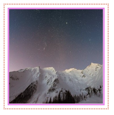
It's pretty self-explanatory. We used an image tag id and selected it in our CSS. Then we used the border for the inner border and an outline for the outer border around our image. And finally, by using outline-offset, we make room between two borders.
Another way of having two borders around an image is by using the box-shadow property. It's pretty straightforward, and just one line of code and, in some cases, is so helpful.
<!DOCTYPE html>
<html lang="en">
  <head>
    <title>Document</title>
  </head>
  <style>
    .container {
      padding: 20px;
    }
    #nature-image {
      box-shadow: 0 0 0 5px violet, 0 0 0 10px tomato; /* add this line,  values are  inset | offset-x | offset-y | color , we just use the color */
    }
  </style>
  <body>
    <div class="container">
      <img src="https://i.ibb.co/fMTGnRz/pexels-photo-572897.jpg" alt="snow-nature" height="300px" width="300px" id="nature-image" />
    </div>
  </body>
</html>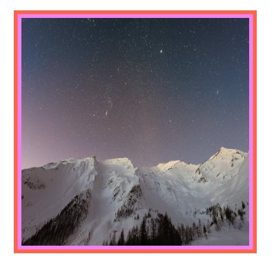
The tip is that the second colour size should be doubled if you want two equal-sized borders. For example, we have the violet-coloured border set to 5px, and then we set the tomato-coloured one to 10 px.
Hope you've enjoyed the examples.