How to Convert an Image into a Grayscale Image With CSS
There are lots of ways to make your image grayscale with the help of CSS. In this snippet, we are going to learn how to convert a colored image into grayscale using CSS properties.
Solution with the CSS filter property
In the example below, we put our image in the <img> tag and then, use the "grayscale" value of the filter property.
Example of creating a grayscale image with the filter property:
<!DOCTYPE html>
<html>
<head>
<title>Title of the document</title>
<style>
img {
-webkit-filter: grayscale(100%);
filter: grayscale(100%);
}
</style>
</head>
<body>
<h2>Convert an image into grayscale using HTML/CSS</h2>
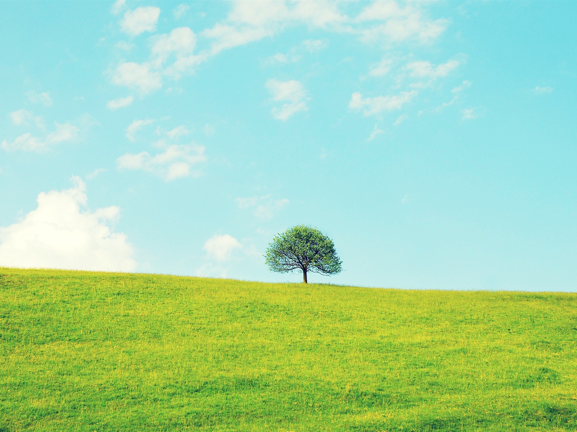
<img src="/uploads/media/default/0001/01/b408569013c0bb32b2afb0f0d45e93e982347951.jpeg" width="400" height="300" alt="tree" />
</body>
</html>Result
Now, let’s see another example.
Example of creating a grayscale image with a hovering effect:
<!DOCTYPE html>
<html>
  <head>
    <title>Title of the document</title>
    <style>
      img {
        -webkit-filter: grayscale(1);
        filter: grayscale(1);
      }
      img:hover {
        -webkit-filter: grayscale(0);
        filter: none;
      }
      h1 {
        color: green;
      }
    </style>
  </head>
  <body>
    <h2>Convert an image into grayscale using HTML/CSS</h2>
    <img src=" /uploads/media/default/0001/01/b408569013c0bb32b2afb0f0d45e93e982347951.jpeg" width="400" height="300" alt="tree" />
  </body>
</html>Solution with the CSS background-blend-mode property
A new way to make the image grayscale is available on modern browsers. The background-blend-mode allows you to get some interesting effects like grayscale conversion. Set this property to its "luminosity" value on a white background.
Example of creating a grayscale image using the background-blend-mode property:
<!DOCTYPE html>
<html>
  <head>
    <title>Title of the document</title>
    <style>
      .example {
        width: 400px;
        height: 300px;
        background: url("/uploads/media/default/0001/01/4982c4f43023330a662b9baed5a407e391ae6161.jpeg"), #fff;
        background-size: cover;
      }
      .example:hover {
        background-blend-mode: luminosity;
      }
    </style>
  </head>
  <body>
    <h2>Convert an image into grayscale using HTML/CSS</h2>
    <div class="example"></div>
  </body>
</html>You can animate the effect setting 3 layers. The first one is the image, and the second is the white-black gradient. On the white part of the gradient, you get the same effect as before. On the black part of the gradient, you are blending the image over itself, and the result is the unmodified image.
Example of creating a grayscale image using a linear-gradient:
<!DOCTYPE html>
<html>
  <head>
    <title>Title of the document</title>
    <style>
      div {
        width: 450px;
        height: 400px;
      }
      .example {
        background: url("/uploads/media/default/0001/01/4982c4f43023330a662b9baed5a407e391ae6161.jpeg"), linear-gradient(0deg, white 33%, black 66%), url("/uploads/media/default/0001/01/4982c4f43023330a662b9baed5a407e391ae6161.jpeg");
        background-position: 0px 0px, 0px 0%, 0px 0px;
        background-size: cover, 100% 300%, cover;
        background-blend-mode: luminosity, multiply;
        transition: all 1.5s;
      }
      .example:hover {
        background-position: 0px 0px, 0px 70%, 0px 0px;
      }
    </style>
  </head>
  <body>
    <h2>Convert an image into grayscale using HTML/CSS</h2>
    <div class="example"></div>
  </body>
</html>