HTML <progress> Tag
The <progress> tag is used to display the progress indicator of the task (progress bar). Examples of using.
The <progress> tag is one of the HTML5 elements. It represents the completion progress of a task — how much of an operation (file upload, download, form step, installation) has been done so far. The browser draws a progress bar whose fill reflects value relative to max.
Because <progress> only describes how far along something is, the actual values usually change at runtime. You update them with JavaScript (see the dynamic example below). The element's exact appearance differs by browser and operating system.
<progress> vs <meter>
These two elements look similar but mean different things — choose by intent, not by looks:
Use <progress> when… | Use <meter> when… |
|---|---|
| You are showing how complete a task is (it moves toward done). | You are showing a static measurement within a known range, like disk usage, a score, or how relevant a search result is. |
The value naturally grows from 0 to max over time. | The value sits somewhere on a fixed scale and is not "in progress". |
A rule of thumb: if you could finish it, use <progress>. If you are just gauging a level, use <meter>.
Syntax
The <progress> tag comes in pairs. The content is written between the opening (<progress>) and closing (</progress>) tags.
Example of the HTML <progress> tag:
HTML <progress> Tag
<!DOCTYPE html>
<html>
  <head>
    <title>Title of the document</title>
  </head>
  <body>
    <label for="file">Loading:</label>
    <progress id="file" value="35" max="100">35%</progress>
  </body>
</html>Result
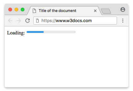
The text between the tags (35% above) is fallback content: browsers that support <progress> ignore it and draw the bar, while very old browsers that don't recognize the element display the text instead. It's good practice to keep it in sync with the current value.
Accessibility: always label your progress bar
A bare <progress> bar is announced by screen readers as a percentage with no context — "35 percent" tells the user nothing about what is loading. Give it an accessible name in one of these ways:
- A
<label>whoseformatches the bar'sid(as above). Clicking the label is also a nice affordance. aria-labelledbypointing at theidof visible text.aria-label="…"when there is no visible text to reference.
<!-- Visible label referenced by the bar -->
<span id="upload-status">Uploading photos</span>
<progress aria-labelledby="upload-status" value="60" max="100">60%</progress>

<!-- No visible text? Use aria-label -->
<progress aria-label="Uploading photos" value="60" max="100">60%</progress>Determinate vs indeterminate
A progress bar can be determinate or indeterminate.
- Determinate — you know how far along the task is, so you provide a
value. The bar fills proportionally (value÷max). - Indeterminate — you know the task is running but not how much is left, so you omit the
valueattribute. The browser shows an animated "activity" bar (a moving stripe or pulse) instead of a fixed fill.
Indeterminate example
Leave out value to get the indeterminate state, then set it once you know the real number:
<!DOCTYPE html>
<html>
  <head>
    <title>Title of the document</title>
  </head>
  <body>
    <label for="task">Working:</label>
    <!-- No value attribute → indeterminate (animated) -->
    <progress id="task" max="100">Working…</progress>
  </body>
</html>This is ideal while you wait for a server response and can't yet compute a percentage. As soon as you can, switch the same element to determinate by setting value from JavaScript (progress.value = 40).
Styling determinate vs indeterminate
It's easier to style the indeterminate bar, since it has no value attribute — you can target it with the CSS negation selector progress:not([value]).
The determinate bar is targeted by the progress[value] selector. Add dimensions with the CSS width and height properties and set the appearance to none:
Styling progress bars
The simple modern way: accent-color
For most cases you no longer need vendor prefixes or pseudo-elements. Set the CSS accent-color property and every modern browser tints the bar consistently with one line:
progress {
  accent-color: #2563eb; /* color of the filled portion */
  width: 200px;
}Reach for the prefixed pseudo-elements below only when you need full control over the track, custom gradients, or have to support older engines.
WebKit/Blink (Chrome/Safari/Opera) — legacy fine-grained styling
Chrome, Safari, and the latest version of Opera (16+) belong to this category. Styling the appearance of the <progress> element can be done with the use of -webkit-appearance: progress-bar.
Set -webkit-appearance: none; to reset the default styles.
Example of a progress bar
progress[value] {
  -webkit-appearance: none;
  appearance: none;
  width: 200px;
  height: 15px;
}Example of the determinate state of the progress bar:
Example of a determinate progress bar:
<!DOCTYPE html>
<html>
  <head>
    <title>Title of the document</title>
    <style>
      progress[value] {
        -webkit-appearance: none;
        appearance: none;
        width: 200px;
        height: 15px;
      }
    </style>
  </head>
  <body>
    <label for="file">Loading:</label>
    <progress id="file" value="30" max="100">30%</progress>
  </body>
</html>After this, you may have problems because separate pseudo-elements are provided by different browsers for styling the progress bar. To solve this problem, you can use fallbacks.
WebKit/Blink provides two pseudo-elements:
::-webkit-progress-bar, which styles the progress element container.::-webkit-progress-value, which styles the value inside the progress bar.
Style the ::-webkit-progress-bar with different CSS properties:
Example of a progress bar
progress[value]::-webkit-progress-bar {
  background-color: #eee;
  border-radius: 2px;
  box-shadow: 0 3px 6px rgba(0, 0, 0, 0.26) inset;
}Style the ::-webkit-progress-value, which is the same as the bar, with several gradient backgrounds for different purposes. Use the -webkit- prefix for the gradients:
webkit-progress-value
progress[value]::-webkit-progress-value {
  background-image: -webkit-linear-gradient(-45deg, transparent 33%, rgba(0, 0, 0, .2) 33%, rgba(0, 0, 0, .2) 66%, transparent 66%), -webkit-linear-gradient(top, rgba(255, 255, 255, .25), rgba(0, 0, 0, .25)), -webkit-linear-gradient(left, #1000ff, #359900);
  border-radius: 4px;
  background-size: 20px 15px, 100% 100%, 100% 100%;
}Example of the HTML <progress> tag used with CSS properties:
Example of the HTML <progress> tag with CSS properties:
<!DOCTYPE html>
<html>
  <head>
    <title>Title of the document</title>
    <style>
      progress[value] {
        -webkit-appearance: none;
        appearance: none;
        width: 200px;
        height: 15px;
      }
      progress[value]::-webkit-progress-bar {
        background-color: #cccccc;
        border-radius: 4px;
      }
      progress[value]::-webkit-progress-value {
        background-image: -webkit-linear-gradient(-45deg, transparent 33%, rgba(0, 0, 0, .2) 33%, rgba(0, 0, 0, .2) 66%, transparent 66%), -webkit-linear-gradient(top, rgba(255, 255, 255, .25), rgba(0, 0, 0, .25)), -webkit-linear-gradient(left, #1000ff, #359900);
        border-radius: 4px;
        background-size: 20px 15px, 100% 100%, 100% 100%;
      }
    </style>
  </head>
  <body>
    <span>Loading:</span>
    <progress value="55" max="100" aria-label="Loading progress"></progress>
  </body>
</html>Firefox
By using appearance: none we can remove the default bevel and emboss. However, this leaves a slight border in Firefox, which can be removed by using border: none. This solves the border issue with Opera 12 as well.
Example of the <progress> bar on Firefox
<!DOCTYPE html>
<html>
  <head>
    <title>Title of the document</title>
    <style>
      progress[value] {
        -webkit-appearance: none;
        -moz-appearance: none;
        appearance: none;
        border: none;
        width: 200px;
        height: 15px;
      }
    </style>
  </head>
  <body>
    <span>Loading:</span>
    <progress value="55" max="100" aria-label="Loading progress"></progress>
  </body>
</html>Firefox provides a single pseudo-element (::-moz-progress-bar) that can be used to target the progress bar value. In other words, we cannot style the background of the container in Firefox.
HTML <progress> Tag - Firefox
progress[value]::-moz-progress-bar {
  background-image: -moz-linear-gradient( 135deg, transparent 33%, rgba(0, 0, 0, 0.1) 33%, rgba(0, 0, 0, 0.1) 66%, transparent 66%), -moz-linear-gradient( top, rgba(255, 255, 255, 0.25), rgba(0, 0, 0, 0.25)), -moz-linear-gradient( left, #ff00f7, #4e922a);
  background-size: 35px 20px, 100% 100%, 100% 100%;
}Firefox doesn't support the ::before or ::after pseudo-elements on the progress bar, and doesn't allow CSS3 keyframe animation on the progress bar, which provides a reduced experience.
Example of the HTML <progress> tag for Firefox:
<!DOCTYPE html>
<html>
  <head>
    <title>Title of the document</title>
    <style>
      progress[value]::-moz-progress-bar {
        background-image: -moz-linear-gradient( 135deg, transparent 33%, rgba(0, 0, 0, 0.1) 33%,
                          rgba(0, 0, 0, 0.1) 66%, transparent 66%),
                          -moz-linear-gradient( top, rgba(255, 255, 255, 0.25),
                          rgba(0, 0, 0, 0.25)),
                          -moz-linear-gradient( left, #ff00f7, #4e922a);
        background-size: 35px 20px, 100% 100%, 100% 100%;
      }
    </style>
  </head>
  <body>
    <span>Loading:</span>
    <progress value="35" max="100" aria-label="Loading progress"></progress>
  </body>
</html>Updating a progress bar with JavaScript
Because a real <progress> element exposes a value property, you update the bar simply by assigning a number to it — the browser redraws the fill for you. Here a timer simulates a download advancing from 0 to 100, then stops:
<!DOCTYPE html>
<html>
  <head>
    <title>Title of the document</title>
  </head>
  <body>
    <label for="download">Downloading:</label>
    <progress id="download" value="0" max="100">0%</progress>
    <span id="status">0%</span>

    <script>
      var bar = document.getElementById("download");
      var status = document.getElementById("status");
      var loaded = 0;

      var timer = setInterval(function () {
        loaded += 5;
        bar.value = loaded;          // moves the bar
        status.textContent = loaded + "%";
        if (loaded >= bar.max) {
          clearInterval(timer);
        }
      }, 300);
    </script>
  </body>
</html>To switch a bar from indeterminate to determinate at runtime, set its value once you know the real number (bar.value = 40). To go back to indeterminate, remove the attribute with bar.removeAttribute("value").
Scroll progress bar (CSS-only alternative)
The element below is built from styled <div>s, not a real <progress> element. It's a common pattern for a page-scroll indicator where you want total control over the look. If you prefer a semantic element, you could swap the <div> for a <progress> and update its value in the scroll handler instead.
Here's how to create a bar that shows how far you have scrolled down the page:
example of how to create a progress bar that shows how far you have scrolled down the page
<!DOCTYPE html>
<html>
  <head>
    <style>
      #progress-bar {
        position: fixed;
        top: 0;
        left: 0;
        width: 100%;
        height: 5px;
        background-color: #ddd;
      }

      #progress-bar-fill {
        height: 100%;
        background-color: blue;
        width: 0%;
      }
    </style>
  </head>
  <body>
    <div id="progress-bar">
      <div id="progress-bar-fill"></div>
    </div>

    <h1>Scrollable Content</h1>
    <p>
      Lorem ipsum dolor sit amet, consectetur adipiscing elit. Sed auctor quam non felis interdum pellentesque. Suspendisse potenti. Nullam molestie neque in justo consectetur, sit amet varius arcu malesuada. Fusce sed laoreet ipsum. Nulla
      facilisi. Donec eleifend auctor purus, eu bibendum risus facilisis sit amet.
    </p>
    <p>
      Lorem ipsum dolor sit amet, consectetur adipiscing elit. Sed auctor quam non felis interdum pellentesque. Suspendisse potenti. Nullam molestie neque in justo consectetur, sit amet varius arcu malesuada. Fusce sed laoreet ipsum. Nulla
      facilisi. Donec eleifend auctor purus, eu bibendum risus facilisis sit amet.
    </p>
    <p>
      Lorem ipsum dolor sit amet, consectetur adipiscing elit. Sed auctor quam non felis interdum pellentesque. Suspendisse potenti. Nullam molestie neque in justo consectetur, sit amet varius arcu malesuada. Fusce sed laoreet ipsum. Nulla
      facilisi. Donec eleifend auctor purus, eu bibendum risus facilisis sit amet.
    </p>
    <p>
      Lorem ipsum dolor sit amet, consectetur adipiscing elit. Sed auctor quam non felis interdum pellentesque. Suspendisse potenti. Nullam molestie neque in justo consectetur, sit amet varius arcu malesuada. Fusce sed laoreet ipsum. Nulla
      facilisi. Donec eleifend auctor purus, eu bibendum risus facilisis sit amet.
    </p>
    <p>
      Lorem ipsum dolor sit amet, consectetur adipiscing elit. Sed auctor quam non felis interdum pellentesque. Suspendisse potenti. Nullam molestie neque in justo consectetur, sit amet varius arcu malesuada. Fusce sed laoreet ipsum. Nulla
      facilisi. Donec eleifend auctor purus, eu bibendum risus facilisis sit amet.
    </p>
    <p>
      Lorem ipsum dolor sit amet, consectetur adipiscing elit. Sed auctor quam non felis interdum pellentesque. Suspendisse potenti. Nullam molestie neque in justo consectetur, sit amet varius arcu malesuada. Fusce sed laoreet ipsum. Nulla
      facilisi. Donec eleifend auctor purus, eu bibendum risus facilisis sit amet.
    </p>
    <p>
      Lorem ipsum dolor sit amet, consectetur adipiscing elit. Sed auctor quam non felis interdum pellentesque. Suspendisse potenti. Nullam molestie neque in justo consectetur, sit amet varius arcu malesuada. Fusce sed laoreet ipsum. Nulla
      facilisi. Donec eleifend auctor purus, eu bibendum risus facilisis sit amet.
    </p>
    <p>
      Lorem ipsum dolor sit amet, consectetur adipiscing elit. Sed auctor quam non felis interdum pellentesque. Suspendisse potenti. Nullam molestie neque in justo consectetur, sit amet varius arcu malesuada. Fusce sed laoreet ipsum. Nulla
      facilisi. Donec eleifend auctor purus, eu bibendum risus facilisis sit amet.
    </p>
    <p>
      Lorem ipsum dolor sit amet, consectetur adipiscing elit. Sed auctor quam non felis interdum pellentesque. Suspendisse potenti. Nullam molestie neque in justo consectetur, sit amet varius arcu malesuada. Fusce sed laoreet ipsum. Nulla
      facilisi. Donec eleifend auctor purus, eu bibendum risus facilisis sit amet.
    </p>
    <p>
      Lorem ipsum dolor sit amet, consectetur adipiscing elit. Sed auctor quam non felis interdum pellentesque. Suspendisse potenti. Nullam molestie neque in justo consectetur, sit amet varius arcu malesuada. Fusce sed laoreet ipsum. Nulla
      facilisi. Donec eleifend auctor purus, eu bibendum risus facilisis sit amet.
    </p>

    <script>
      window.addEventListener("scroll", function () {
        var progressBarFill = document.getElementById("progress-bar-fill");
        var scrollPosition = window.scrollY;
        var totalHeight = document.body.scrollHeight - window.innerHeight;
        var percentage = (scrollPosition / totalHeight) * 100;
        progressBarFill.style.width = percentage + "%";
      });
    </script>
  </body>
</html>In this example, we have a fixed-position div with an id of progress-bar that serves as the container. Inside it, another div with an id of progress-bar-fill serves as the moving fill. (Because this is a decorative scroll indicator rather than a task, a plain <div> is acceptable here; a real <progress> would also work if you set its value in the same handler.)
We've used CSS to set the initial width and height of the progress bar, as well as the background colors for the progress bar and the progress bar fill.
We've also included a JavaScript event listener that listens for the scroll event on the window object. When the user scrolls the page, we calculate the scroll position and the total height of the page, and then calculate the percentage of the page that has been scrolled. We update the width property of the progress-bar-fill element to reflect this percentage, thereby updating the progress bar.
You can copy this code into a new HTML file and open it in your web browser to see how it looks. As you scroll down the page, the progress bar will update to reflect how far you have scrolled. You can adjust the height and color of the progress bar to suit your needs.
Attributes
| Attribute | Value | Description |
|---|---|---|
| max | number | Defines the maximum value of the current process. The value can be a positive number bigger than 0. |
| value | number | Defines the size of the completed task. The value can be a number from 0 to the number indicated in the max attribute, or a number in the range from 0 to 1 if the max attribute isn’t specified. |
The <progress> tag also supports the Global Attributes and the Event Attributes.