The <meter> tag is one of the HTML5 elements. The tag defines a scalar measurement in the known range or graphic representation of a fractional number. The tag can be used when it is necessary to display, for example, the level of battery charge, disk usage, etc. To use the <meter> tag, you need to know the maximum value.
Syntax
The <meter> tag comes in pairs. The content is written between the opening (<meter>) and closing (</meter>) tags.
Example of the HTML <meter> tag:
<!DOCTYPE html>
<html>
<head>
<title>Title of the document</title>
</head>
<body>
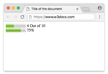
<meter value="4" min="0" max="10">4 out of 10</meter> 4 Out of 10<br>
<meter value="0.75">75%</meter> 75%
</body>
</html>Result
Example of the HTML <progress> tag used with CSS background-color, box-shadow, width and height properties:
<!DOCTYPE html>
<html>
  <head>
    <title>Title of the document</title>
    <style>
      progress[value] {
        -webkit-appearance: none;
        appearance: none;
        width: 220px;
        height: 20px;
      }
      progress[value]::-webkit-progress-bar {
        background-color: #eee;
        box-shadow: 0 0 3px #666 inset;
      }
      progress[value]::-webkit-progress-value {
        background: -webkit-linear-gradient(-45deg, transparent 30%, #8ebf42 70%, #8ebf42 40%, transparent 30%),
        -webkit-linear-gradient(top, #96f204, #8ebf42),
        -webkit-linear-gradient(right, #96f204, #8ebf42);
        background-size: 40px 20px,  10%;
      }
    </style>
  </head>
  <body>
    <p>Downloading:
      <progress value="35" max="100"></progress>
      <span>35%</span>
    </p>
    <p>Progress bar:
      <progress value="80" max="100"></progress>
      <span>80%</span>
    </p>
  </body>
</html>Displaying a Number Range
Using the min and max attributes of the display property will show a score inside of a specified range. Use the optimum attribute to define the desired number, for example, a pass mark in a test. But take into account that this is not supported by some browsers.
<meter value="15" min="0" max="70" optimum="60"></meter>Displaying a Percentage
<meter value="0.8">80%</meter>Styling the HTML <meter> tag:
First of all, put the sizes with the help of the width and height properties.
meter {
  width: 300px;
  height: 20px;
}
Here, you need to use fallbacks because separate pseudo-classes are provided by the A-grade browsers to style the <meter> element. We will use the Webkit/Blink fallback. It provides the following pseudo-classes:
| Pseudo-class | Description |
|---|---|
| -webkit-meter-inner-element | Additional markup that is used for rendering the meter element as read-only. |
| -webkit-meter-bar | It contains meter gauge holding the value. |
| -webkit-meter-optimum-value | The current value of the meter element which is by default green when the value attribute falls within the low-high range. |
| -webkit-meter-suboptimum-value | The meter tag becomes yellow when the value attribute is outside the low-high range. |
| -webkit-meter-even-less-good-value | The meter tag becomes red when the value and the optimum attributes are outside the low-high range but in opposite zones. For example, value < low < high < optimum or value > high > low > optimum. |
Then, we'll need to set the default appearance of the meter gauge to "none".
meter {
  -webkit-appearance: none;
}
In our example, we will use the -webkit-meter-bar and -webkit-meter-optimum-value pseudo-classes.
meter::-webkit-meter-bar {
  background: none;
  background-color: lightgrey;
  box-shadow: 0 3px 3px -3px #333 inset;
}

meter::-webkit-meter-optimum-value {
  box-shadow: 0 3px 3px -3px #999 inset;
  background-image: linear-gradient( 90deg, #2286c9 5%, #FF00FF 5%, #FF00FF 15%, #04C319 15%, #04C319 55%, #F1F70D 55%, #F1F70D 95%, #00FFCC 95%, #00FFCC 100%);
  background-size: 100% 100%;
}
Each color in the background linear gradient presents the space that is consumed by the sub-categories.
meter::-webkit-meter-optimum-value {
  -webkit-transition: width .5s;
}

meter::-webkit-meter-optimum-value:hover {
  background-image: linear-gradient( 90deg, #8bcf69 20%, #e6d450 20%, #e6d450 40%, #f28f68 40%, #f28f68 60%, #cf82bf 60%, #cf82bf 80%, #719fd1 80%, #719fd1 100%);
  transition: width .5s;
  width: 100%;
}
Example of styling the HTML <meter> tag:
<!DOCTYPE html>
<html>
  <head>
    <title>Title of the document</title>
    <style>
      meter {
        width: 300px;
        height: 20px;
      }
      meter::-webkit-meter-bar {
        background: none;
        background-color: lightgrey;
        box-shadow: 0 3px 3px -3px #333 inset;
      }
      meter::-webkit-meter-optimum-value {
        box-shadow: 0 3px 3px -3px #999 inset;
        background-image: linear-gradient( 90deg, #2286c9 5%, #FF00FF 5%, #FF00FF 15%, #04C319 15%, #04C319 55%, #F1F70D 55%, #F1F70D 95%, #00FFCC 95%, #00FFCC 100%);
        background-size: 100% 100%;
      }
    </style>
  </head>
  <body>
    <meter value="30" min="0" max="70"></meter>
  </body>
</html>Both the transition and animation properties on the <meter> element are supported by Webkit browsers. Change the width of the value (on :hover) using transitions and animate the background-position of the container with keyframes.
Example of styling the HTML <meter> tag with the CSS transition property:
<!DOCTYPE html>
<html>
  <head>
    <title>Title of the document</title>
    <style>
      meter {
        width: 300px;
        height: 20px;
      }
      meter::-webkit-meter-bar {
        background: none;
        background-color: lightgrey;
        box-shadow: 0 3px 3px -3px #333 inset;
      }
      meter::-webkit-meter-optimum-value {
        -webkit-transition: width .5s;
        box-shadow: 0 5px 5px -5px #999 inset;
        background-image: linear-gradient( 90deg, #2286c9 5%, #FF00FF 5%, #FF00FF 15%, #04C319 15%, #04C319 55%, #F1F70D 55%, #F1F70D 95%, #00FFCC 95%, #00FFCC 100%);
        background-size: 100% 100%;
      }
      meter::-webkit-meter-optimum-value:hover {
        /* Reset each sub-category to 20% */
        background-image: linear-gradient( 90deg, #2286c9 20%, #FF00FF 20%, #FF00FF 40%, #04C319 40%, #04C319 60%, #F1F70D 60%, #F1F70D 80%, #00FFCC 80%, #00FFCC 100%);
        transition: width .5s;
        width: 100% !important;
      }
    </style>
  </head>
  <body>
    <meter value="25" min="0" max="70"></meter>
  </body>
</html>Pseudo-elements on meter gauge are supported only by Webkit browsers. The pseudo-elements can be used for displaying the meta information above the meter gauge.
meter {
  margin: 2em;
  position: relative;
}

meter::before {
  content: 'Used storage';
  position: absolute;
  top: -100%;
}

meter::after {
  content: 'Free storage';
  position: absolute;
  top: -100%;
  right: 0;
}
Example of the HTML <meter> tag used with pseudo-elements:
<!DOCTYPE html>
<html>
  <head>
    <title>Title of the document</title>
    <style>
      meter {
        margin: 2em;
        width: 400px;
        height: 30px;
        position: relative;
      }
      meter::before {
        content: 'Used storage';
        position: absolute;
        top: -100%;
      }
      meter::after {
        content: 'Free storage';
        position: absolute;
        top: -100%;
        right: 0;
      }
      meter::-webkit-meter-bar {
        background: none;
        background-color: lightgray;
        box-shadow: 0 5px 5px -5px #333 inset;
      }
      meter::-webkit-meter-optimum-value {
        -webkit-transition: width .5s;
        box-shadow: 0 5px 5px -5px #999 inset;
        background-image: linear-gradient( 90deg, #8bcf69 5%, #e6d450 5%, #e6d450 15%, #f28f68 15%, #f28f68 55%, #cf82bf 55%, #cf82bf 95%, #719fd1 95%, #719fd1 100%);
        background-size: 100% 100%;
      }
      meter::-webkit-meter-optimum-value:hover {
        /* Reset each sub-category to 20% */
        background-image: linear-gradient( 90deg, #8bcf69 20%, #e6d450 20%, #e6d450 40%, #f28f68 40%, #f28f68 60%, #cf82bf 60%, #cf82bf 80%, #719fd1 80%, #719fd1 100%);
        transition: width .5s;
        width: 100% !important;
        /* !important required. to override the inline styles in WebKit. */
      }
    </style>
  </head>
  <body>
    <meter value="25" min="0" max="70"></meter>
  </body>
</html>Now, let’s use the Firefox fallback. Paint the meter gauge using the -moz-appearence: meterbar. If you don’t need the default bevel and emboss set the -moz-appearence to "none".
meter {
  -moz-appearance: none;
  width: 400px;
  height: 30px;
}
The Firefox uses the following pseudo-classes:
| Pseudo-class | Description |
|---|---|
| -moz-meter-bar | Represents the meter gauge’s current value to style the properties of the meter gauge value. |
| -moz-meter-optimum | The meter tag becomes green when the value attribute is inside the low-high range. |
| -moz-meter-sub-optimum | The meter tag becomes yellow when the value attribute is outside the low-high range. |
| -moz-meter-sub-sub-optimum | The meter element becomes red when the value and the optimum attributes are outside the low-high range but in opposite zones. For example, value < low < high < optimum or value > high > low > optimum. |
Here, we will style the background of the meter gauge value using the ::-moz-meter-bar pseudo-class.
meter::-moz-meter-bar {
  box-shadow: 0 5px 5px -5px #999 inset;
  background-image: linear-gradient( 90deg, #2286c9 5%, #FF00FF 5%, #FF00FF 15%, #04C319 15%, #04C319 55%, #F1F70D 55%, #F1F70D 95%, #00FFCC 95%, #00FFCC 100%);
  background-size: 100% 100%;
}
In Firefox, you can use the meter selector itself to style the background of the container.
meter {
  background: none;
  background-color: lightgray;
  box-shadow: 0 5px 5px -5px #333 inset;
}
Example of the HTML <meter> tag for Firefox:
<!DOCTYPE html>
<html>
  <head>
    <title>Title of the document</title>
    <style>
      meter {
        width: 400px;
        height: 30px;
        background: none;
        /* Required to get rid of the default background property */
        background-color: lightgray;
        box-shadow: 0 5px 5px -5px #333 inset;
      }
      meter::-moz-meter-bar {
        box-shadow: 0 5px 5px -5px #999 inset;
        background-image: linear-gradient( 90deg, #2286c9 5%, #FF00FF 5%, #FF00FF 15%, #04C319 15%, #04C319 55%, #F1F70D 55%, #F1F70D 95%, #00FFCC 95%, #00FFCC 100%);
        background-size: 100% 100%;
      }
    </style>
  </head>
  <body>
    <meter value="30" min="0" max="70"></meter>
  </body>
</html>The ::before and ::after pseudo elements on the meter gauge are not supported by Firefox. The support for CSS3 transitions and animation is weak, too.
Attributes
| Attribute | Value | Description |
|---|---|---|
| form | form_id | Indicates form (forms), which the <meter> tag belongs to. |
| high | number | Indicates high values (but not maximum ones). If the high value is less than the low, then the high = low. If high is set larger than max, then high = max. |
| low | number | Defines law values (but not minimal ones). This value must be less than high. If the low value is less than the min, then low = min. |
| max | number | Defines the maximum possible value. The default value is 1. |
| min | number | Defines the minimum possible value. The default value is 0. |
| optimum | number |
Defines the optimal number, which must be within the range defined by the min and max attributes. It may be larger than the high value. Color depends on the location of the optimum: red: min ≤ optimum < low yellow: low ≤ optimum ≤ high green: high < optimum ≤ max |
| value | number |
Sets the current value, which must be within the range, defined by the min and max attributes. Required attribute. |
The<meter> tag supports the Global Attributes and the Event Attributes.
Browser support
|
|
|
|
|---|---|---|---|
| 8+ | 6+ | 6+ | 11+ |
Practice Your Knowledge
Quiz Time: Test Your Skills!
Ready to challenge what you've learned? Dive into our interactive quizzes for a deeper understanding and a fun way to reinforce your knowledge.