How to Auto-Resize the Image to fit an HTML Container
It is not complicated to make the image stretch to fit the <div> container. CSS makes it possible to resize the image so as to fit an HTML container. To auto-resize an image or a video, you can use various CSS properties, which are described in this tutorial. It’s very easy if you follow the steps described below.
Let’s see an example and try to discuss each part of the code.
Create HTML
- Create a <div> element with a class "box".
- Set the URL of your image in the <img> tag with the src attribute and specify the alt attribute as well.
<body>
  <div class="box">
    <img src="https://pp.userapi.com/c622225/v622225117/10f33/47AAEI48pJU.jpg?ava=1"  alt="Example image"/>
  </div>
</body>
Add CSS
- Set the height and width of the <div>.
- You can add border to your <div> by using the border property with values of border-width, border-style and border-color properties.
- Set the height and width to "100%" for the image.
.box {
  width: 30%;
  height: 200px;
  border: 5px dashed #f7a239;
}

img {
  width: 100%; /* takes the 100 % width of its container (.box div)*/
  height: 100%; /* takes the 100 % height of its container (.box div)*/
}
Let’s combine the code parts and see how it works! Here is the result of our code.
Example of auto-resizing an image with the width and height properties:
<!DOCTYPE html>
<html>
  <head>
    <title>Title of the document</title>
    <style>
      body {
        background: crimson;
      }
      .box {
        width: 40%;
        height: 200px;
        border: 5px solid gold;
      }
      img {
        width: 100%;
        height: 100%;
      }
    </style>
  </head>
  <body>
    <div class="box">
      <img src="/uploads/media/default/0001/05/f32e5dec539f7c03f44990789d49d67c20c3e040.jpg" alt="Example image" />
    </div>
  </body>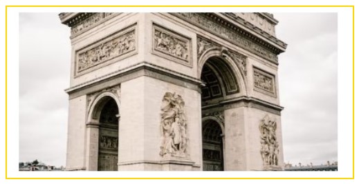
</html>Here's our result:

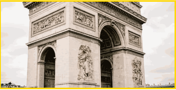
The image takes 40% width and 200px height of its container (red background).
In the example below, we use the "cover" value of the object-fit property. When using the "cover" value, the aspect ratio of the content is sized while filling the element's content box. It will be clipped to fit the content box.
You can use other values like contain, scale-down, etc. for object-fit and make sure to check them as well. Still, we'll mostly use the cover value as we like our image to cover its container as much as it doesn't hurt the aspect ratio.
Example of resizing an image using the object-fit property set to “cover”:
<!DOCTYPE html>
<html>
<head>
<style>
.container {
width: 60%;
height: 300px;
border: 5px solid gold;
}
img {
width: 100%;
height: 100%;
object-fit: cover;
}
</style>
</head>
<body>
<div class="container">
<img src="https://images.unsplash.com/photo-1581974267369-3f2fe3b4545c?ixlib=rb-1.2.1&ixid=eyJhcHBfaWQiOjEyMDd9&auto=format&fit=crop&w=500&q=60" alt="Image" />
</div>
</body>
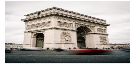
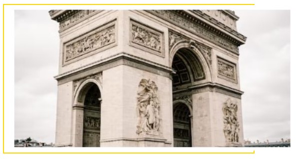
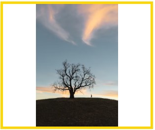
</html>This image will help you understand it better! See how the image fits its aspect ratio based on the screen size changes!
See another example where the image size is set manually, and the object-fit property is set as well. In this case, when the browser is resized, the image will preserve its aspect ratio and won’t be resized according to the container.
Example of resizing an image using the object-fit property:<!DOCTYPE html>
<html>
<head>
<style>
body {
text-align: center;
}
img {
width: 400px;
height: 200px;
object-fit: cover;
}
</style>
</head>
<body>
<img src="https://images.unsplash.com/photo-1581974267369-3f2fe3b4545c?ixlib=rb-1.2.1&ixid=eyJhcHBfaWQiOjEyMDd9&auto=format&fit=crop&w=500&q=60" alt="Image" />
</body>
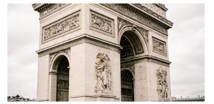
</html>Let's see this example without object-fit property first! Ugly, huh? You're right!
Now here comes the magic!
In the next example, we use the max-width and the rules can be applied to max-height as well. The max-height property sets the maximum height of an element, and the max-width property sets the maximum width of an element. To resize an image proportionally, set either the height or width to "100%", but not both. If you set both to "100%", the image will be stretched.
Example of auto-resizing an image with the max-width and max-height properties:
<!DOCTYPE html>
<html>
  <head>
    <title>Title of the document</title>
    <style>
      img {
        width: 600px; /* image initial width */
      }
      div {
        border: 2px dotted #000000;
      }
      .container {
        width: 500px; /* container initial width */
        border: 2px solid gold;
      }
    </style>
  </head>
  <body>
    <div class="container">
      <img src="/uploads/media/default/0001/05/8dc771228e65a66d63299043ad824e26fb9b879f.jpg" alt="Circle portrait" />
    </div>
  </body>
</html>Here's the problem! Our image is out of its container because its width (600px) is bigger than its container width (500px)!
To solve our problem, we'll use the max-width: 100% property, which not allows the image to take any width bigger than its container (here, not more than 500px).
Now, it will scale down when the width is less than 500px. The same rule is applicable for max-height property.
<!DOCTYPE html>
<html>
  <head>
    <title>Title of the document</title>
    <style>
      img {
        width: 600px;
        max-width: 100%; /* add this line */
      }
      .container {
        height: 100%;
        width: 500px;
        border: 2px solid gold;
      }
    </style>
  </head>
  <body>
    <div class="container">
      <img src="https://www.w3docs.com//uploads/media/default/0001/05/8dc771228e65a66d63299043ad824e26fb9b879f.jpg" alt="image example" />
    </div>
  </body>
</html>To use an image as a CSS background, use the background-size property. This property offers two special values: contain and cover. Let's see examples of these values.
Example of resizing an image using the background-size property set to “contain” & "cover":
<!DOCTYPE html>
<html>
  <head>
    <title>Title of the document</title>
    <style>
      .box {
        width: 300px;
        height: 250px;
        border: 5px solid gold;
        background-image: url("https://images.unsplash.com/photo-1582093236149-516a8be696fe?ixlib=rb-1.2.1&ixid=eyJhcHBfaWQiOjEyMDd9&auto=format&fit=crop&w=500&q=60");
        background-size: contain; /* try other properties here like cover, contain, etc */
        background-repeat: no-repeat;
        background-position: 50% 50%;
      }
    </style>
  </head>
  <body>
    <div class="box"></div>
  </body>
</html>Here's what contain will give us!
Let's try cover value!

Much better! I hope you've enjoyed it all!