How to Create an Image Slider or Slideshow
Image Slider or Image Carousel is a way to display multiple website images. Fancy pictures can attract a lot of visitors to the website.
Usually, image sliders are created with the help of JavaScript, but with the release of CSS3, this can also be done by using pure CSS3. In this article, we will learn how the slideshow effect can be created keeping the minimum code of CSS, and in the second part of the article, we will consider the ways of making image sliders with JavaScript. So, let’s come to their discussion below.
Creating Image Sliders Using Only CSS3
Probably, you have seen heavy sliders based on JavaScript. Such sliders make the webpage slower and also fail if the user has disabled the interpretation of JavaScript in the browser. Not using these sliders is one solution to this problem, but how would you implement a slider without JavaScript? Let's see a proper slider working without JavaScript.
Example of creating a slideshow with pure CSS:
<!DOCTYPE html>
<html>
  <head>
    <title>Slideshow Images</title>
    <style>
      .slider {
        width: 500px;
        height: 300px;
        background-color: yellow;
        margin-left: auto;
        margin-right: auto;
        margin-top: 0px;
        text-align: center;
        overflow: hidden;
      }
      .image-container {
        width: 1500px;
        background-color: pink;
        height: 300px;
        clear: both;
        position: relative;
        -webkit-transition: left 2s;
        -moz-transition: left 2s;
        -o-transition: left 2s;
        transition: left 2s;
      }
      .slide {
        float: left;
        margin: 0px;
        padding: 0px;
        position: relative;
      }
      #slide-1:target ~ .image-container {
        left: 0px;
      }
      #slide-2:target ~ .image-container {
        left: -500px;
      }
      #slide-3:target ~ .image-container {
        left: -1000px;
      }
      .buttons {
        position: relative;
        top: -20px;
      }
      .buttons a {
        display: inline-block;
        height: 15px;
        width: 15px;
        border-radius: 50px;
        background-color: lightgreen;
      }
    </style>
  </head>
  <body>
    <div class="slider">
      <span id="slide-1"></span>
      <span id="slide-2"></span>
      <span id="slide-3"></span>
      <div class="image-container">
        <img src="/uploads/media/default/0001/03/66cf5094908491e69d8187bcf934050a4800b37f.jpeg" class="slide" width="500" height="300" />
        <img src="/uploads/media/default/0001/03/b7d624354d5fa22e38b0ab1f9b905fb08ccc6a05.jpeg" class="slide" width="500" height="300" />
        <img src="/uploads/media/default/0001/03/5bfad15a7fd24d448a48605baf52655a5bbe5a71.jpeg" class="slide" width="500" height="300" />
      </div>
      <div class="buttons">
        <a href="#slide-1"></a>
        <a href="#slide-2"></a>
        <a href="#slide-3"></a>
      </div>
    </div>
  </body>
</html>Result


Example of creating an image slider:
<!DOCTYPE html>
<html>
  <head>
    <title>Image Slider</title>
    <style>
      body {
        margin: 10px auto;
        text-align: center;
      }
      .content {
        max-width: 800px;
        text-align: left;
        margin: auto;
      }
      .simple-ss {
        width: 800px;
        height: 250px;
        background-color: #eeeeee;
        margin: auto;
        background-image: url("/uploads/media/default/0001/03/5bfad15a7fd24d448a48605baf52655a5bbe5a71.jpeg");
        animation-name: slide;
        animation-duration: 10s;
        animation-direction: normal;
        animation-timing-function: ease;
        animation-iteration-count: infinite;
      }
      @keyframes slide {
        0% {
          background-position: 0 0;
        }
        16.66% {
          background-position: 0 0;
        }
        33.32% {
          background-position: -800px 0;
        }
        49.98% {
          background-position: -800px 0;
        }
        66.64% {
          background-position: -1600px 0;
        }
        83.30% {
          background-position: -1600px 0;
        }
        100% {
          background-position: 0 0;
        }
      }
    </style>
  </head>
  <body>
    <div class="simple-ss"></div>
    <div class="content">
      <p>
        This is a proof-of-concept for a slideshow that doesn't use any Javascript. It does not have pages or left/right buttons etc.
      </p>
    </div>
  </body>
</html>Here see an example where the background images are set to act like sliders.
Example of making background images act like sliders:
<!DOCTYPE html>
<html>
  <head>
    <title>Image Slider</title>
    <style>
      html,
      body {
        width: 100%;
        height: 100%;
        margin: 0;
        padding: 0;
        font-family: "Helvetica", sans-serif;
      }
      img {
        max-width: 100%;
      }
      .slider-container {
        height: 100%;
        width: 100%;
        position: relative;
        overflow: hidden;
        text-align: center;
      }
      .menu {
        position: absolute;
        left: 0;
        z-index: 900;
        width: 100%;
        bottom: 0;
      }
      .menu label {
        cursor: pointer;
        display: inline-block;
        width: 16px;
        height: 16px;
        background: #fff;
        border-radius: 50px;
        margin: 0 0.2em 1em;
      }
      .menu label:hover,
      .menu label:focus {
        background: #1c87c9;
      }
      .slide {
        width: 100%;
        height: 100%;
        position: absolute;
        top: 0;
        left: 100%;
        z-index: 10;
        padding: 8em 1em 0;
        background-size: cover;
        background-position: 50% 50%;
        transition: left 0s 0.75s;
      }
      [id^="slide"]:checked + .slide {
        left: 0;
        z-index: 100;
        transition: left 0.65s ease-out;
      }
      .slide-1 {
        background-image: url("/uploads/media/default/0001/03/5bfad15a7fd24d448a48605baf52655a5bbe5a71.jpeg");
      }
      .slide-2 {
        background-image: url("/uploads/media/default/0001/03/66cf5094908491e69d8187bcf934050a4800b37f.jpeg");
      }
      .slide-3 {
        background-image: url("/uploads/media/default/0001/03/b87b29b6ca67b64b76651037dc16f5a46e73b42a.jpeg");
      }
    </style>
  </head>
  <body>
    <div class="slider-container">
      <div class="menu">
        <label for="slide-dot-1"></label>
        <label for="slide-dot-2"></label>
        <label for="slide-dot-3"></label>
      </div>
      <input id="slide-dot-1" type="radio" name="slides" checked>
      <div class="slide slide-1"></div>
      <input id="slide-dot-2" type="radio" name="slides">
      <div class="slide slide-2"></div>
      <input id="slide-dot-3" type="radio" name="slides">
      <div class="slide slide-3"></div>
    </div>
  </body>
</html>Creating Slides with Jumping Links
A slider usually has a little UI to jump to a particular slide, so let's also do that semantically, with anchor links jumping to the correct slide.
Create your jumping links using the <a> anchor tag. Add a bit of styling and get some buttons.
To make sure that you will get a smooth sliding effect on both desktop and mobile, add the scroll-behavior property with its "smooth" value. Then, use the :target pseudo-class for something special to the "active" slide. Clicking on one of the slide navigation buttons changes the URL to the # hash, and that's when :target comes into effect.
Example of creating slides with jumping links:
<!DOCTYPE html>
<html>
  <head>
    <title>Image Slider</title>
    <style>
      * {
        box-sizing: border-box;
      }
      .slider {
        width: 300px;
        text-align: center;
        overflow: hidden;
      }
      .slides {
        display: flex;
        overflow-x: auto;
        scroll-snap-type: x mandatory;
        scroll-behavior: smooth;
        -webkit-overflow-scrolling: touch;
      }
      .slides::-webkit-scrollbar {
        width: 10px;
        height: 10px;
      }
      .slides::-webkit-scrollbar-thumb {
        background: #666;
        border-radius: 10px;
      }
      .slides::-webkit-scrollbar-track {
        background: transparent;
      }
      .slides > div {
        scroll-snap-align: start;
        flex-shrink: 0;
        width: 300px;
        height: 300px;
        margin-right: 50px;
        border-radius: 10px;
        background: #eee;
        transform-origin: center center;
        transform: scale(1);
        transition: transform 0.5s;
        position: relative;
        display: flex;
        justify-content: center;
        align-items: center;
        font-size: 100px;
      }
      .slider > a {
        display: inline-flex;
        width: 1.5rem;
        height: 1.5rem;
        background: white;
        text-decoration: none;
        align-items: center;
        justify-content: center;
        border-radius: 50%;
        margin: 0 0 0.5rem 0;
        position: relative;
      }
      .slider > a:active {
        top: 1px;
        color: #1c87c9;
      }
      .slider > a:focus {
        background: #eee;
      }
      /* Don't need button navigation */
      @supports (scroll-snap-type) {
        .slider > a {
          display: none;
        }
      }
      html,
      body {
        height: 100%;
        overflow: hidden;
      }
      body {
        display: flex;
        align-items: center;
        justify-content: center;
        background: linear-gradient(to right, #1c87c9, #ffcc00);
        font-family: 'Ropa Sans', sans-serif;
      }
    </style>
  </head>
  <body>
    <div class="slider">
      <a href="#slide-1">1</a>
      <a href="#slide-2">2</a>
      <a href="#slide-3">3</a>
      <a href="#slide-4">4</a>
      <a href="#slide-5">5</a>
      <div class="slides">
        <div id="slide-1">1</div>
        <div id="slide-2">2</div>
        <div id="slide-3">3</div>
        <div id="slide-4">4</div>
        <div id="slide-5">5</div>
      </div>
    </div>
  </body>
</html>Creating Slideshow or Carousel with CSS and JavaScript
First thing you should do is to create the structure of the image slider using HTML and place images.
After you have created your image slider HTML structure, the next step is to use CSS styles for having your slider’s interface. Also, add styles to the images, backgrounds, etc. You also need to style the dots and make your images responsive and browser friendly using CSS properties.
Now, it’s the time for adding the JavaScript part to provide the functionality for making images auto changing after a specific time interval.
Example of creating a slideshow with CSS and JavaScript:
<!DOCTYPE html>
<html>
<head>
<title>Slideshow Images</title>
<style>
* {
box-sizing: border-box
}
body {
font-family: Verdana, sans-serif;
margin: 0
}
.mySlides {
display: none
}
img {
vertical-align: middle;
}
.slideshow-container {
max-width: 1000px;
position: relative;
margin: auto;
}
/* Next & previous buttons */
.prev,
.next {
cursor: pointer;
position: absolute;
top: 50%;
width: auto;
padding: 16px;
margin-top: -22px;
color: white;
font-weight: bold;
font-size: 18px;
transition: 0.6s ease;
border-radius: 0 3px 3px 0;
user-select: none;
}
/* Position the "next button" to the right */
.next {
right: 0;
border-radius: 3px 0 0 3px;
}
/* On hover, add a black background color with a little bit see-through */
.prev:hover,
.next:hover {
background-color: rgba(0, 0, 0, 0.8);
}
/* Caption text */
.text {
color: #ffffff;
font-size: 15px;
padding: 8px 12px;
position: absolute;
bottom: 8px;
width: 100%;
text-align: center;
}
/* Number text (1/3 etc) */
.numbertext {
color: #ffffff;
font-size: 12px;
padding: 8px 12px;
position: absolute;
top: 0;
}
/* The dots/bullets/indicators */
.dot {
cursor: pointer;
height: 15px;
width: 15px;
margin: 0 2px;
background-color: #999999;
border-radius: 50%;
display: inline-block;
transition: background-color 0.6s ease;
}
.active,
.dot:hover {
background-color: #111111;
}
/* Fading animation */
.fade {
-webkit-animation-name: fade;
-webkit-animation-duration: 1.5s;
animation-name: fade;
animation-duration: 1.5s;
}
@-webkit-keyframes fade {
from {
opacity: .4
}
to {
opacity: 1
}
}
@keyframes fade {
from {
opacity: .4
}
to {
opacity: 1
}
}
/* On smaller screens, decrease text size */
@media only screen and (max-width: 300px) {
.prev,
.next,
.text {
font-size: 11px
}
}
</style>
</head>
<body>
<div class="slideshow-container">
<div class="mySlides fade">
<div class="numbertext">1 / 3</div>
<img src="/uploads/media/default/0001/03/66cf5094908491e69d8187bcf934050a4800b37f.jpeg" style="width:100%">
<div class="text">London, Ebgland</div>
</div>
<div class="mySlides fade">
<div class="numbertext">2 / 3</div>
<img src="/uploads/media/default/0001/03/b7d624354d5fa22e38b0ab1f9b905fb08ccc6a05.jpeg" style="width:100%">
<div class="text">Sunset in Romania</div>
</div>
<div class="mySlides fade">
<div class="numbertext">3 / 3</div>
<img src="/uploads/media/default/0001/03/5bfad15a7fd24d448a48605baf52655a5bbe5a71.jpeg" style="width:100%">
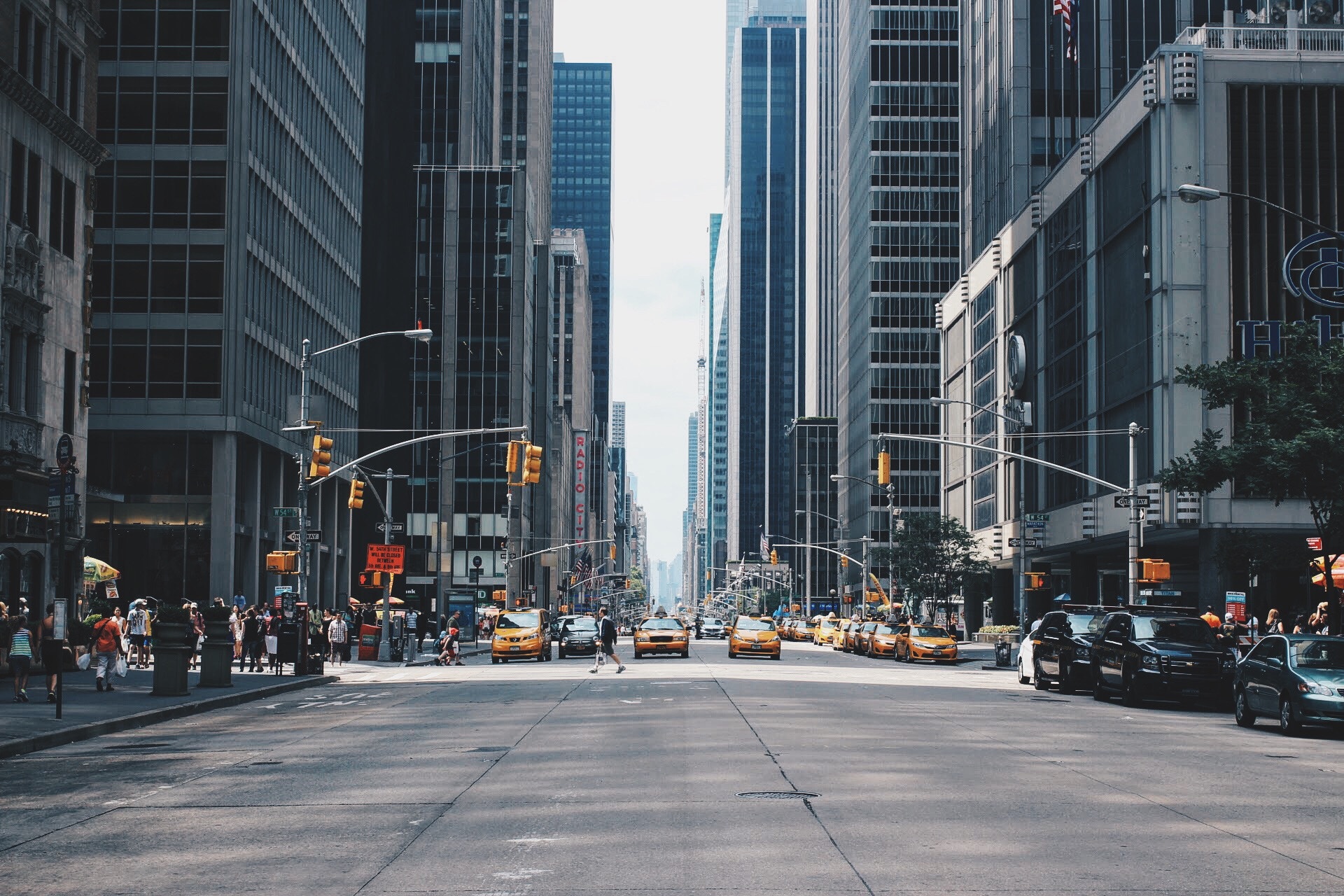
<div class="text">New York, USA</div>
</div>
<a class="prev" onclick="plusSlides(-1)">❮</a>
<a class="next" onclick="plusSlides(1)">❯</a>
</div>
<br>
<div style="text-align:center">
<span class="dot" onclick="currentSlide(1)"></span>
<span class="dot" onclick="currentSlide(2)"></span>
<span class="dot" onclick="currentSlide(3)"></span>
</div>
<script>
var slideIndex = 1;
showSlides(slideIndex);
function plusSlides(n) {
showSlides(slideIndex += n);
}
function currentSlide(n) {
showSlides(slideIndex = n);
}
function showSlides(n) {
var i;
var slides = document.getElementsByClassName("mySlides");
var dots = document.getElementsByClassName("dot");
if(n > slides.length) {
slideIndex = 1
}
if(n < 1) {
slideIndex = slides.length
}
for(i = 0; i < slides.length; i++) {
slides[i].style.display = "none";
}
for(i = 0; i < dots.length; i++) {
dots[i].className = dots[i].className.replace(" active", "");
}
slides[slideIndex - 1].style.display = "block";
dots[slideIndex - 1].className += " active";
}
</script>
</body>
</html>For creating an automatic slideshow, use the code below.
Example of creating an automatic slideshow with CSS and JavaScript:
<!DOCTYPE html>
<html>
<head>
<title>Slideshow Images</title>
<style>
* {
box-sizing: border-box
}
body {
font-family: Verdana, sans-serif;
margin: 0
}
.mySlides {
display: none
}
img {
vertical-align: middle;
}
.slideshow-container {
max-width: 1000px;
position: relative;
margin: auto;
}
/* Next & previous buttons */
.prev,
.next {
cursor: pointer;
position: absolute;
top: 50%;
width: auto;
padding: 16px;
margin-top: -22px;
color: white;
font-weight: bold;
font-size: 18px;
transition: 0.6s ease;
border-radius: 0 3px 3px 0;
user-select: none;
}
/* Position the "next button" to the right */
.next {
right: 0;
border-radius: 3px 0 0 3px;
}
/* On hover, add a black background color with a little bit see-through */
.prev:hover,
.next:hover {
background-color: rgba(0, 0, 0, 0.8);
}
/* Caption text */
.text {
color: #ffffff;
font-size: 15px;
padding: 8px 12px;
position: absolute;
bottom: 8px;
width: 100%;
text-align: center;
}
/* Number text (1/3 etc) */
.numbertext {
color: #ffffff;
font-size: 12px;
padding: 8px 12px;
position: absolute;
top: 0;
}
/* The dots/bullets/indicators */
.dot {
cursor: pointer;
height: 15px;
width: 15px;
margin: 0 2px;
background-color: #999999;
border-radius: 50%;
display: inline-block;
transition: background-color 0.6s ease;
}
.active,
.dot:hover {
background-color: #111111;
}
/* Fading animation */
.fade {
-webkit-animation-name: fade;
-webkit-animation-duration: 1.5s;
animation-name: fade;
animation-duration: 1.5s;
}
@-webkit-keyframes fade {
from {
opacity: .4
}
to {
opacity: 1
}
}
@keyframes fade {
from {
opacity: .4
}
to {
opacity: 1
}
}
/* On smaller screens, decrease text size */
@media only screen and (max-width: 300px) {
.prev,
.next,
.text {
font-size: 11px
}
}
</style>
</head>
<body>
<div class="slideshow-container">
<div class="mySlides fade">
<div class="numbertext">1 / 3</div>
<img src="https://www.w3docs.com/uploads/media/default/0001/03/66cf5094908491e69d8187bcf934050a4800b37f.jpeg" style="width:100%">
<div class="text">London, Ebgland</div>
</div>
<div class="mySlides fade">
<div class="numbertext">2 / 3</div>
<img src="https://www.w3docs.com/uploads/media/default/0001/03/b7d624354d5fa22e38b0ab1f9b905fb08ccc6a05.jpeg" style="width:100%">
<div class="text">Sunset in Romania</div>
</div>
<div class="mySlides fade">
<div class="numbertext">3 / 3</div>
<img src="https://www.w3docs.com/uploads/media/default/0001/03/5bfad15a7fd24d448a48605baf52655a5bbe5a71.jpeg" style="width:100%">
<div class="text">New York, USA</div>
</div>
<a class="prev" onclick="plusSlides(-1)">❮</a>
<a class="next" onclick="plusSlides(1)">❯</a>
</div>
<br>
<div style="text-align:center">
<span class="dot" onclick="currentSlide(0)"></span>
<span class="dot" onclick="currentSlide(1)"></span>
<span class="dot" onclick="currentSlide(2)"></span>
</div>
<script>
let slideIndex = 0;
let timeoutId = null;
const slides = document.getElementsByClassName("mySlides");
const dots = document.getElementsByClassName("dot");
showSlides();
function currentSlide(index) {
slideIndex = index;
showSlides();
}
function plusSlides(step) {
if(step < 0) {
slideIndex -= 2;
if(slideIndex < 0) {
slideIndex = slides.length - 1;
}
}
showSlides();
}
function showSlides() {
for(let i = 0; i < slides.length; i++) {
slides[i].style.display = "none";
dots[i].classList.remove('active');
}
slideIndex++;
if(slideIndex > slides.length) {
slideIndex = 1
}
slides[slideIndex - 1].style.display = "block";
dots[slideIndex - 1].classList.add('active');
if(timeoutId) {
clearTimeout(timeoutId);
}
timeoutId = setTimeout(showSlides, 5000); // Change image every 5 seconds
}
</script>
</body>
</html>