Which Image Will the Browser Download?
Build a responsive article cover with srcset and sizes, give the lighthouse its own crop on small screens, and check which file the browser chose.
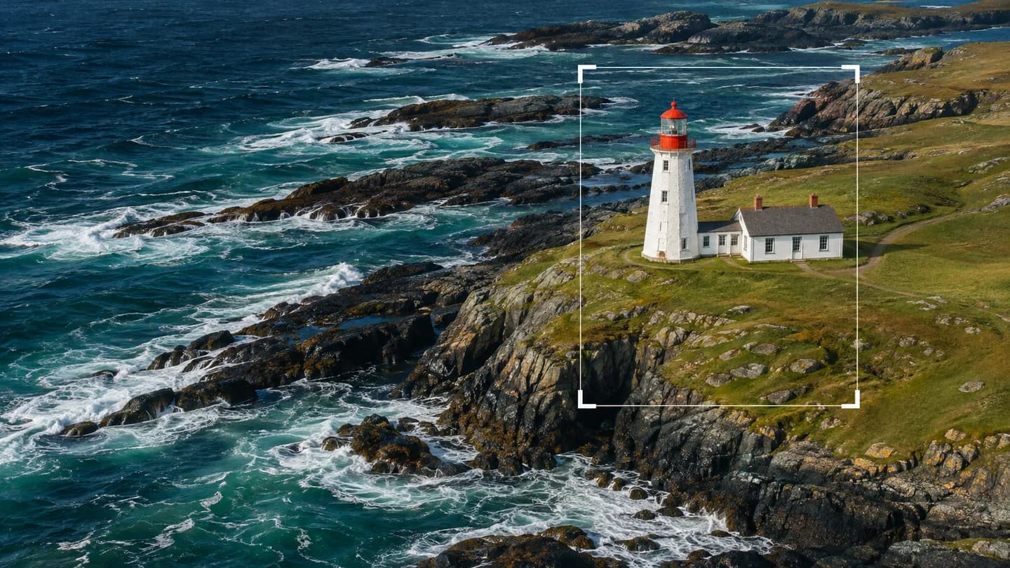
A lighthouse makes a good test for an article cover. On a laptop, a wide photograph shows where the tower sits along the coast. Shrink the whole scene to the width of a phone and the tower becomes a speck. There are two decisions to make before publishing that photo. How many pixels does the reader need? Which part of the coast should they see?
Calculate the space the image will occupy
Suppose the cover fills an article column. The page leaves a 16-pixel gutter on either side, and the column stops growing at 720 pixels. Here is the entire layout for this example.
body {
  margin: 0;
}

.story {
  width: min(720px, calc(100vw - 32px));
  margin-inline: auto;
}

.story img {
  display: block;
  width: 100%;
  height: auto;
}At a viewport width of 390 CSS pixels, the image is 358 pixels wide. The column reaches its full 720 pixels when the viewport reaches 752. Those two numbers come directly from the layout, so we can give the browser that information before it fetches the photo.
Offer several resolutions of the same composition
Export the wide photo at 480, 720, and 1440 pixels across. In your own project, substitute the paths to those files. Each number ending in w must equal the actual width of the file beside it. If a 720-pixel file is labeled 1440w, the browser will overestimate how much detail that candidate can supply.
<article class="story">
  <img
    src="coast-720.jpg"
    srcset="coast-480.jpg 480w, coast-720.jpg 720w, coast-1440.jpg 1440w"
    sizes="(min-width: 752px) 720px, calc(100vw - 32px)"
    width="1440"
    height="810"
    alt="A white lighthouse with a red lantern room."
  >
</article>Read sizes from left to right. At 752 pixels and up, the browser uses 720 pixels as the expected display width. Below that breakpoint it subtracts the two gutters. CSS still sets the displayed width. The width and height attributes give the browser the photo’s 16:9 shape so it can reserve space while the file loads.
On our 390-pixel viewport, a screen with two device pixels per CSS pixel needs about 716 source pixels across to show the 358-pixel image at full density. The 720-pixel file is a close match. On a 2× screen with a viewport at least 752 CSS pixels wide, the column reaches 720 CSS pixels and the target becomes 1440 source pixels. The browser makes the final selection and can take other factors into account, including a higher-resolution copy already in its cache. HTML Standard on adaptive images
Change the crop when the subject gets lost
Open the phone layout and look at the tower. If the subject is too small, downloading more pixels of the same scene will sharpen the coastline without making the lighthouse any larger. Export a portrait crop centered on the tower, as marked in the cover photograph. Use a picture element to offer that crop on narrow screens.
Replace the previous img inside .story with this markup. Keep the same CSS. Here the portrait crop applies through 479 pixels. This is an editorial choice for this photograph. Inspect the wide composition at 480 and 600 pixels before adopting the same breakpoint for your own cover.
<picture>
  <source
    media="(max-width: 479px)"
    srcset="tower-480.jpg 480w, tower-960.jpg 960w"
    sizes="calc(100vw - 32px)"
    width="480"
    height="600"
  >
  <img
    src="coast-720.jpg"
    srcset="coast-480.jpg 480w, coast-720.jpg 720w, coast-1440.jpg 1440w"
    sizes="(min-width: 752px) 720px, calc(100vw - 32px)"
    width="1440"
    height="810"
    alt="A white lighthouse with a red lantern room."
  >
</picture>At 390 pixels, the media condition matches and the browser chooses between the two portrait files. Both should have the same 4:5 proportions. In browsers that support dimensions on picture sources, the dimensions on source reserve the taller frame for that crop. At 800 pixels, the browser uses the wide candidates on img. Keep the alternative text there, and describe something a reader would learn from either composition. W3docs guide to the picture element
Check the chosen file in DevTools
In Chrome DevTools, open Network, select Disable cache, and filter by Img. In device mode, set the pixel ratio to 2 and the viewport to 390 CSS pixels. Reload and wait for the image. The display target is 716 source pixels, so expect tower-960.jpg under ordinary conditions. Set the viewport to 800 CSS pixels, keep the ratio at 2, and reload again. The 720-pixel column now has a 1440-pixel target, so expect coast-1440.jpg. The browser has discretion over resolution. The filename prefix tells you which composition matched even if the resolution differs. The transferred size in Network tells you what each choice costs. Chrome DevTools Network reference
To compare the layout and resource selection in one place, run this in the page’s console after the image has loaded.
const cover = document.querySelector('.story img')
console.table({
  displayedWidth: cover.getBoundingClientRect().width,
  pixelRatio: window.devicePixelRatio,
  chosenFile: cover.currentSrc,
})If you later add a sidebar, run the check again. A 720-pixel column that becomes 450 pixels wide at a new breakpoint needs a corresponding entry in sizes. Matching the markup to the space the image actually gets is what keeps the smaller download available to readers.
Tagged