The column-width property defines the width of columns. The number of columns should be the minimum number that is required for displaying all the content through the element.
The column-width property is one of the CSS3 properties.
It has two values: auto and length. "Auto" is the default value of the column-width property. "Length" specifies the width of columns in px, em and ch. The column-width property is flexible. The columns will drop into one column if at least two columns at the specified width can not be fitted. If the width of the box is narrower than the specified value, the width of the single column will be smaller than the specified column width.
With this property, you can also create responsive designs for different screen sizes.
| Initial Value | auto |
| Applies to | Block containers except table wrapper boxes. |
| Inherited | No. |
| Animatable | Yes. The border and width are animatable. |
| Version | CSS3 |
| DOM Syntax | object.style.columnRuleWidth = "5px"; |
Syntax
column-width: auto | length | initial | inherit;Example of the column-width property:
<!DOCTYPE html>
<html>
<head>
<title>Title of the document</title>
<style>
div {
-webkit-column-width: 80px;
/* Chrome, Safari, Opera */
-moz-column-width: 80px;
/* Firefox */
column-width: 80px;
}
</style>
</head>
<body>
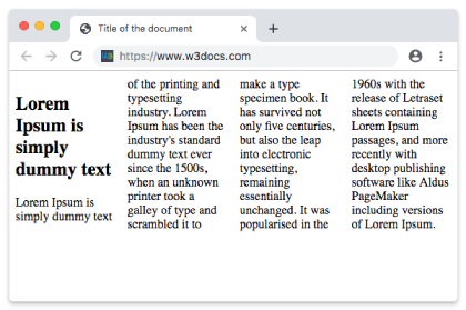
<h1>Column-width property example</h1>
<p>Here the width f the column is set to 80px.</p>
<div>
Lorem Ipsum is dummy text of the printing and typesetting industry. Lorem Ipsum has been the industry's standard dummy text ever since the 1500s when an unknown printer took a galley of type and scrambled it to make a type specimen book. It has survived not only five centuries, but also the leap into electronic typesetting, remaining essentially unchanged. It was popularised in the 1960s with the release of Letraset sheets containing Lorem Ipsum passages, and more recently with desktop publishing software like Aldus PageMaker including versions of Lorem Ipsum.
</div>
</body>
</html>Result
Example of the column-width property with the "auto" value:
<!DOCTYPE html>
<html>
  <head>
    <title>Title of the document</title>
    <style>
      div {
        -webkit-column-width: auto;  /* Chrome, Safari, Opera */
        -moz-column-width: auto; /* Firefox */
        column-width: auto;
      }
    </style>
  </head>
  <body>
    <h1>Column-width property example</h1>
    <p>Here the width f the column is set to auto.</p>
    <div>
      Lorem Ipsum is dummy text of the printing and typesetting industry. Lorem Ipsum has been the industry's standard dummy text ever since the 1500s when an unknown printer took a galley of type and scrambled it to make a type specimen book. It has survived not only five centuries, but also the leap into electronic typesetting, remaining essentially unchanged. It was popularised in the 1960s with the release of Letraset sheets containing Lorem Ipsum passages, and more recently with desktop publishing software like Aldus PageMaker including versions of Lorem Ipsum.
    </div>
  </body>

</html>Values
| Value | Description | Play it |
|---|---|---|
| auto | The width of the column is specified by the browser. This is default value. | Play it » |
| length | The width of columns is specified by length. | Play it » |
| initial | Sets the property to its default value. | Play it » |
| inherit | Inherits the property from its parent element. |
Browser support
|
|
|
|
|
|---|---|---|---|---|
|
50.0 -webkit- |
12.0 -webkit- |
50.0 + 11.5 -moz- |
3.0 -webkit- |
11.1 + |
Practice Your Knowledge
Quiz Time: Test Your Skills!
Ready to challenge what you've learned? Dive into our interactive quizzes for a deeper understanding and a fun way to reinforce your knowledge.