The flex-flow property is considered to be a shorthand property for the flex-wrap and flex-direction properties.
This property is one of the CSS3 properties. It is a part of the Flexible Box Layout module.
If there are not flexible items, the flex-flow property will not have any effect.
The flex-flow property is used with the -Webkit- extension for such browsers, as Safari, Google Chrome, and Opera.
| Initial Value | row nowrap |
| Applies to | Flex containers |
| Inherited | No. |
| Animatable | No. |
| Version | CSS3 |
| DOM Syntax | object.style.flexFlow = "column nowrap"; |
Syntax
flex-flow: flex-direction | flex-wrap | initial | inherit;When we set the flex-flow: row wrap, it means that the first value defines the flex-direcion, and the second one defines the flex-wrap property.
-webkit-flex-flow: row wrap;
flex-flow: row wrap;
The following code is the same as the code above.
-webkit-flex-direction: row;
flex-direction: row;
-webkit-flex-wrap: wrap;
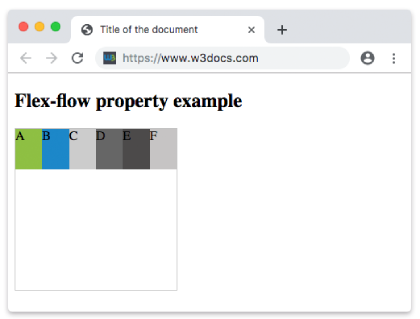
flex-wrap: wrap;Example of the flex-flow property with the "row" and "wrap" values:
<!DOCTYPE html>
<html>
  <head>
    <title>Title of the document</title>
    <style>
      .example {
        width: 200px;
        height: 200px;
        border: 1px solid #c3c3c3;
        display: -webkit-flex;
        display: flex;
        -webkit-flex-flow: row wrap;
        flex-flow: row wrap;
      }
      .example div {
        width: 50px;
        height: 50px;
      }
    </style>
  </head>
  <body>
    <h2>Flex-flow property example</h2>
    <div class="example">
      <div style="background-color: #8ebf42;">A</div>
      <div style="background-color: #1c87c9;">B</div>
      <div style="background-color: #cccccc;">C</div>
      <div style="background-color: #666666;">D</div>
      <div style="background-color: #4c4a4a;">E</div>
      <div style="background-color: #c6c4c4;">F</div>
    </div>
  </body>
</html>Example of the flex-flow property with the "wrap-reverse" and "column" values:
<!DOCTYPE html>
<html>
  <head>
    <title>Title of the document</title>
    <style>
      .example {
        width: 200px;
        height: 200px;
        border: 1px solid #c3c3c3;
        display: -webkit-flex;
        color: #ffffff;
        text-align: right;
        display: flex;
        -webkit-flex-flow: column wrap-reverse;
        flex-flow: column wrap-reverse;
      }
      .example div {
        width: 50px;
        height: 50px;
      }
    </style>
  </head>
  <body>
    <h2>Flex-flow property example</h2>
    <div class="example">
      <div style="background-color: #8ebf42;">A</div>
      <div style="background-color: #1c87c9;">B</div>
      <div style="background-color: #cccccc;">C</div>
      <div style="background-color: #666666;">D</div>
      <div style="background-color: #4c4a4a;">E</div>
      <div style="background-color: #c6c4c4;">F</div>
    </div>
  </body>
</html>Example of the flex-flow property with the "row" and "nowrap" values:
<!DOCTYPE html>
<html>
  <head>
    <title>Title of the document</title>
    <style>
      .example {
        width: 200px;
        height: 200px;
        border: 1px solid #c3c3c3;
        display: -webkit-flex;
        display: flex;
        -webkit-flex-flow: row nowrap;
        flex-flow: row nowrap;
      }
      .example div {
        width: 50px;
        height: 50px;
      }
    </style>
  </head>
  <body>
    <h2>Flex-flow property example</h2>
    <div class="example">
      <div style="background-color: #8ebf42;">A</div>
      <div style="background-color: #1c87c9;">B</div>
      <div style="background-color: #cccccc;">C</div>
      <div style="background-color: #666666;">D</div>
      <div style="background-color: #4c4a4a;">E</div>
      <div style="background-color: #c6c4c4;">F</div>
    </div>
  </body>
</html>Result
Example of the flex-flow property with the "row-reverse" and "nowrap" values:
<!DOCTYPE html>
<html>
  <head>
    <title>Title of the document</title>
    <style>
      .example {
        width: 200px;
        height: 200px;
        border: 1px solid #c3c3c3;
        display: -webkit-flex;
        display: flex;
        -webkit-flex-flow: row-reverse nowrap;
        flex-flow: row-reverse nowrap;
      }
      .example div {
        width: 50px;
        height: 50px;
      }
    </style>
  </head>
  <body>
    <h2>Flex-flow property example</h2>
    <div class="example">
      <div style="background-color: #8ebf42;">A</div>
      <div style="background-color: #1c87c9;">B</div>
      <div style="background-color: #cccccc;">C</div>
      <div style="background-color: #666666;">D</div>
      <div style="background-color: #4c4a4a;">E</div>
      <div style="background-color: #c6c4c4;">F</div>
    </div>
  </body>
</html>Example of the flex-flow property with the "column" and "nowrap" values:
<!DOCTYPE html>
<html>
  <head>
    <title>Title of the document</title>
    <style>
      .example {
        width: 200px;
        height: 200px;
        border: 1px solid #c3c3c3;
        display: -webkit-flex;
        color: #ffffff;
        text-align: right;
        display: flex;
        -webkit-flex-flow: column nowrap;
        flex-flow: column nowrap;
      }
      .example div {
        width: 50px;
        height: 50px;
      }
    </style>
  </head>
  <body>
    <h2>Flex-flow property example</h2>
    <div class="example">
      <div style="background-color: #8ebf42;">A</div>
      <div style="background-color: #1c87c9;">B</div>
      <div style="background-color: #cccccc;">C</div>
      <div style="background-color: #666666;">D</div>
      <div style="background-color: #4c4a4a;">E</div>
      <div style="background-color: #c6c4c4;">F</div>
    </div>
  </body>
</html>Example of the flex-flow property with the "column-reverse" and "nowrap" values:
<!DOCTYPE html>
<html>
  <head>
    <title>Title of the document</title>
    <style>
      .example {
        width: 200px;
        height: 200px;
        border: 1px solid #c3c3c3;
        display: -webkit-flex;
        color: #ffffff;
        text-align: right;
        display: flex;
        -webkit-flex-flow: column-reverse nowrap;
        flex-flow: column-reverse nowrap;
      }
      .example div {
        width: 50px;
        height: 50px;
      }
    </style>
  </head>
  <body>
    <h2>Flex-flow property example</h2>
    <div class="example">
      <div style="background-color: #8ebf42;">A</div>
      <div style="background-color: #1c87c9;">B</div>
      <div style="background-color: #cccccc;">C</div>
      <div style="background-color: #666666;">D</div>
      <div style="background-color: #4c4a4a;">E</div>
      <div style="background-color: #c6c4c4;">F</div>
    </div>
  </body>
</html>Values
| Value | Description | Play it |
|---|---|---|
| flex-direction |
Defines flexible items' direction.
Possible values are: row row-reverse column column-reverse initial inherit |
Play it » |
| flex-wrap | Defines whether flexible items should wrap or not.
Possible values are: nowrap wrap wrap-reverse initial inherit |
Play it » |
| initial | Makes the property use its default value. | Play it » |
| inherit | Inherits the property from its parents element. |
Browser support
|
|
|
|
|---|---|---|---|
|
29.0+ 21-28 -webkit- |
28.0+ |
9.0+ 6.1-8.0 -webkit- |
12.1+ |
Practice Your Knowledge
What is correct about the 'flex-flow' property in CSS?
Correct!
Incorrect!
Quiz Time: Test Your Skills!
Ready to challenge what you've learned? Dive into our interactive quizzes for a deeper understanding and a fun way to reinforce your knowledge.