The CSS text-shadow property is used to add shadows to the text. You can choose colors from here: HTML colors.
The text-shadow property is one of the CSS3 properties.
Each shadow is specified by 2 to 3 length values and a <color>. The first value sets the horizontal distance(x-offset), the second value sets the vertical distance(y-offset), the third value sets the blur radius and color value sets the shadow color.
The x-offset and the y-offset are obligatory,the third value is optional.
| Initial Value | none |
| Applies to | All elements. It also applies to ::first-letter and ::first-line. |
| Inherited | Yes. |
| Animatable | Yes. |
| Version | CSS3 |
| DOM Syntax | object.style.textShadow = "1px 3px 3px #8ebf42"; |
Syntax
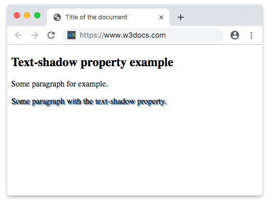
text-shadow: h-shadow v-shadow blur-radius color | none | initial | inherit;Example of the text-shadow property:
<!DOCTYPE html>
<html>
  <head>
    <title>Title of the document</title>
    <style>
      .shadow {
        text-shadow: 2px 2px #1c87c9;
      }
    </style>
  </head>
  <body>
    <h2>Text-shadow property example</h2>
    <p>Some paragraph for example.</p>
    <p class="shadow">Some paragraph with the text-shadow property.</p>
  </body>
</html>Result
Example of the text-shadow property with the “x-offset”, “y-offset”, “blur-radius” and “color” values:
<!DOCTYPE html>
<html>
  <head>
    <style>
      p {
        text-shadow: 5px 3px 2px #8ebf42;
        font: 1em Roboto, Helvetica, sans-serif;
      }
    </style>
  </head>
  <body>
    <h2>Text-shadow property example</h2>
    <p>Lorem Ipsum is simply dummy text of the printing and typesetting industry. Lorem Ipsum has been the industry's standard dummy text ever since the 1500s, when an unknown printer took a galley of type and scrambled it to make a type specimen book.</p>
  </body>
</html>Values
| Value | Description | Play it |
|---|---|---|
| h-shadow | The horizontal offset of the shadow. If positive the shadow is drawn on the right side of the text, if negative it is drawn on the left side. | Play it » |
| v-shadow | The vertical offset of the shadow (y-axis). If the value is positive the shadow is below the text, if negative it is drawn above. | Play it » |
| blur-radius | The blur radius defines how big and how much blurred the shadow is. We can't use negative values. Default value is 0. | Play it » |
| color | Allows us to choose a color of the shadow. Color names, hexadecimal color codes, rgb(), rgba(), hsl(), hsla() can be used. | Play it » |
| none | No shadow is specified. This is default value of this property. | Play it » |
| initial | Makes the property use its default value. | Play it » |
| inherit | Inherits the property from its parents element. |
Browser support
|
|
|
|
|
|---|---|---|---|---|
| 4.0+ | 12.0+ | 3.5+ | 4.0+ | 10.0+ |
Practice Your Knowledge
Which of the following statements are true about the CSS text-shadow property?
Correct!
Incorrect!
Quiz Time: Test Your Skills!
Ready to challenge what you've learned? Dive into our interactive quizzes for a deeper understanding and a fun way to reinforce your knowledge.