The <input> tag is used within the <form> element and defines fields for user input. The type of the field (text, checkbox, radio button, password field, etc.) is determined by the value of the type attribute. The tag doesn’t have a text content, it contains only attributes.
It belongs to a tag group called form elements.
To associate text with a specific element, we use the <label> tag which sets a text label for it.
Syntax
The <input> tag is empty, which means that the closing tag isn’t required. But in XHTML, the (<input>) tag must be closed (<input/>).
Example of the HTML <input> tag:
<!DOCTYPE html>
<html>
  <head>
    <title>Title of the document</title>
  </head>
  <body>
    <form action="/form/submit" method="get">
      <input type="email" name="user_email" placeholder="Enter your email" />
      <input type="submit" value="Submit" />
    </form>
  </body>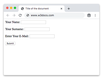
</html>Example of the HTML <input> tag with the HTML <label> tag:
<!DOCTYPE html>
<html>
  <head>
    <title>Title of the document</title>
  </head>
  <body>
    <form action="/form/submit" method="get">
      <label>Your Name:</label>
      <input type="text" name="first_name" />
      <br/>
      <br/>
      <label>Your Surname:</label>
      <input type="text" name="last_name" />
      <br/>
      <br/>
      <label>Enter Your E-Mail:</label>
      <input type="email" name="user_email" />
      <br/>
      <br/>
      <input type="submit" value="Submit" />
    </form>
  </body>
</html>Result
Attributes
The main attribute that determines the type of input field is type. If the attribute is missing, the default value is "text".
| Attribute | Value | Description |
|---|---|---|
| accept | audio/* video/* image/* MIME_type |
Specifies the types of files you can send via the file upload field. (Used with the type="file"). |
| align | left right top middle bottom |
Defines the alignment type of the image. (Used only with images). Not supported in HTML5. |
| alt | text |
Defines the alternate text for the image. (Used only with images). |
| autocomplete | on off |
Enables/disables autocomplete.
New attribute in HTML5. |
| autofocus | autofocus | Indicates that the form field should receive focus after the page loads.
New attribute in HTML5. |
| checked | checked |
Indicates that the element should be preselected when the page loads. (Used only for <input type = "checkbox"> and <input type = "radio">). |
| disabled | disabled | Indicates that the element must be not available for user interaction. |
| form | form_id | Indicates the form (specified by the <form> element) of the control element. The value is the form identifier (id) in the same document. New attribute in HTML5. |
| formaction | URL |
Specifies the address where the form data will be sent when clicking on the button. (Used only for <input type = "image"> and <input type = "submit">). |
| formenctype | application/x-www-form- urlencoded multipart/form-data text/plain |
Determines how to encode the form data before sending it to the server. (Used only for <input type = "image"> and <input type = "submit">) All symbols are encoded before being sent (default value). Symbols aren’t being encoded. Spaces are replaced with the "+" sign, but symbols aren’t encoded. |
| formmethod | Indicates HTTP Request Method, which will be used when sending the form data. (Used only for <input type = "image"> and <input type = "submit">) |
|
| get | It sends form data in the address bar (“name = value”), which is added to the page URL after the question mark and are separated by an ampersand (&). (http://example.ru/doc/?name=Ivan&password=vanya) | |
| post | The browser connects to the server and sends the data for processing. | |
| formnovalidate | formnovalidate |
Indicates, that it is not necessary to check the data for correctness. (Used only for <input type = "submit">). |
| formtarget |
Specifies, where to display the response after submitting the form. (Used only for <input type = "image"> and <input type = "submit">). |
|
| -blank | Opens the response in a new window. | |
| _self | Opens the response in the current window. | |
| _parent | Opens the response in the parent frame. | |
| _top | Opens the response to the full width of the window. | |
| height | pixels | Defines the height of the element (Used only for <input type = "image">). |
| inputmode | verbatim latin latin-name latin-prose full-width-latin kana katakana numeric tel url |
Defines the keyboard layout. |
| list | datalist_id | Defines a list of options from which the user can choose. The value for the attribute is the id of the <datalist> element. |
| max | number date |
Sets the upper value for entering a number or a date. |
| maxlength | number | Defines the maximal number of symbols, that the user can input. |
| min | number date |
Sets the minimal value for entering a number or a date. |
| multiple | multiple | Indicates that the user can input more than one value in the element (only for <input type = "file"> and <input type = "email">). |
| name | text | Defines the name of the element. (Used for form identification). |
| pattern | regexp |
Specifies a regular expression,
according to which you need to enter and verify data in the form field. (Only for control elements text, search, tel, url, email and password). |
| placeholder | text | Defines a short prompt that describes the expected value for the input field. The user sees a hint in the input field. It disappears when the user starts entering data or when the field receives focus. |
| readonly | readonly | Defines that the input field is enabled only for reading. The user cannot make changes. |
| required | required | Indicates that the input field must be completed before submitting the form. |
| selectionDirection | forward backward none |
Defines the direction of the selection. |
| size | number | Defines the size of the text field. (Only for text, search, tel, url, email and password). Default number of symbols in 20. |
| src | URL | Indicates the path to the image that is used as the "send" button. (Only used for <input type = "image">). |
| step | number | Sets the increment step (increment value) for numeric fields. Used with the min and max attributes which define the minimal and maximal values. |
| type |
button
checkbox color date datetime datetime-local file hidden image month number password radio range reset search submit tel text time url week |
Defines the type of the input field. |
| value | text | Defines the value of the element. |
| width | width | Defines the width of the element (only for <input type = "image">). |
The <input> tag also supports the Global attributes and the Event Attributes.
Values of the type attribute
| Value | Description |
|---|---|
| button | Defines the active button. |
| checkbox | Check the boxes (the user can select more than one of the options). |
| color | Specifies a color palette (user can select color values in hexadecimal). |
| date | Defines the input field for calendar date. |
| datetime | Defines the input field for date and time. |
| datetime-local | Defines the input field for date and time without a time zone. |
| Defines the input field for e-mail. | |
| file | Sets the control with the Browse button, clicking on which you can select and load the file. |
| hidden | Defines a hidden input field. It is not visible to the user. |
| image | Indicates that an image is used instead of a button to send data to the server. The path to the image is indicated by the src attribute. The alt attribute can also be used to specify alternative text, the height and width attributes to specify the height and width of the image. |
| month | Defines the field of selecting a month, after which the data will be displayed as year-month (for example: 2018-07). |
| number | Defines the input field for numbers. |
| password | Defines a field for entering a password (the entered characters are displayed as asterisks, dots or other characters). |
| radio | Creates radio button (when choosing one radio button all others will be disabled). |
| range | Creates a slider to select numbers in the specified range. The default range is from 0 to 100. The range of numbers is specified by the min and max attributes. |
| reset | Defines a button for resetting information. |
| search | Creates a text field for search. |
| submit | Creates a button of submitting the form data (“submit” button). |
| text | Creates a single line text field. |
| time | Specifies a numeric field for entering time in a 24-hour format (for example, 13:45). |
| url | Creates an input field for URL. |
| week | Creates a field for selecting the week, after which the data will be displayed as year-week (for example: 2018-W25). |
How to style <input> tag?
Common properties to alter the visual weight/emphasis/size of text in <input> tag:
- CSS font-style property sets the style of the font. normal | italic | oblique | initial | inherit.
- CSS font-family property specifies a prioritized list of one or more font family names and/or generic family names for the selected element.
- CSS font-size property sets the size of the font.
- CSS font-weight property defines whether the font should be bold or thick.
- CSS text-transform property controls text case and capitalization.
- CSS text-decoration property specifies the decoration added to text, and is a shorthand property for text-decoration-line, text-decoration-color, text-decoration-style.
Coloring text in <input> tag:
- CSS color property describes the color of the text content and text decorations.
- CSS background-color property sets the background color of an element.
Text layout styles for <input> tag:
- CSS text-indent property specifies the indentation of the first line in a text block.
- CSS text-overflow property specifies how overflowed content that is not displayed should be signalled to the user.
- CSS white-space property specifies how white-space inside an element is handled.
- CSS word-break property specifies where the lines should be broken.
Other properties worth looking at for <input> tag:
- CSS text-shadow property adds shadow to text.
- CSS text-align-last property sets the alignment of the last line of the text.
- CSS line-height property specifies the height of a line.
- CSS letter-spacing property defines the spaces between letters/characters in a text.
- CSS word-spacing property sets the spacing between words.
Browser support
|
|
|
|
|
|---|---|---|---|---|
| ✓ | ✓ | ✓ | ✓ | ✓ |
Practice Your Knowledge
Quiz Time: Test Your Skills!
Ready to challenge what you've learned? Dive into our interactive quizzes for a deeper understanding and a fun way to reinforce your knowledge.